KUANGYI Flooring
"Nature is the art of God" is also the art of the growth, development and evolution of places and brands.
Nature has natural and unnatural forms, naturally it also has forms similar to nature. The mixing of different forms presents a real or fictional, simulated and ambiguous organic three-dimensional, with different and very accurate forms, which are then perceived by the body, described by words and defined by cognition.
The macro of nature in a broad sense is disassembled, leading to the daily nuances of life, forming a peaceful and self correcting natural state deep in the heart, which has become the significance of active exploration of space. "Nature is the art of God" is also the art of the growth, development and evolution of places and brands.
Frontage Interface
━
In the European style buildings facing the street side by side, as the advocate of "natural lifestyle", KUANGYI flooring experience store has ushered in a new transformation. In contrast to the complicated styles of the surrounding decorationism, the simple and powerful facade of modern buildings has become an obvious brand store move.
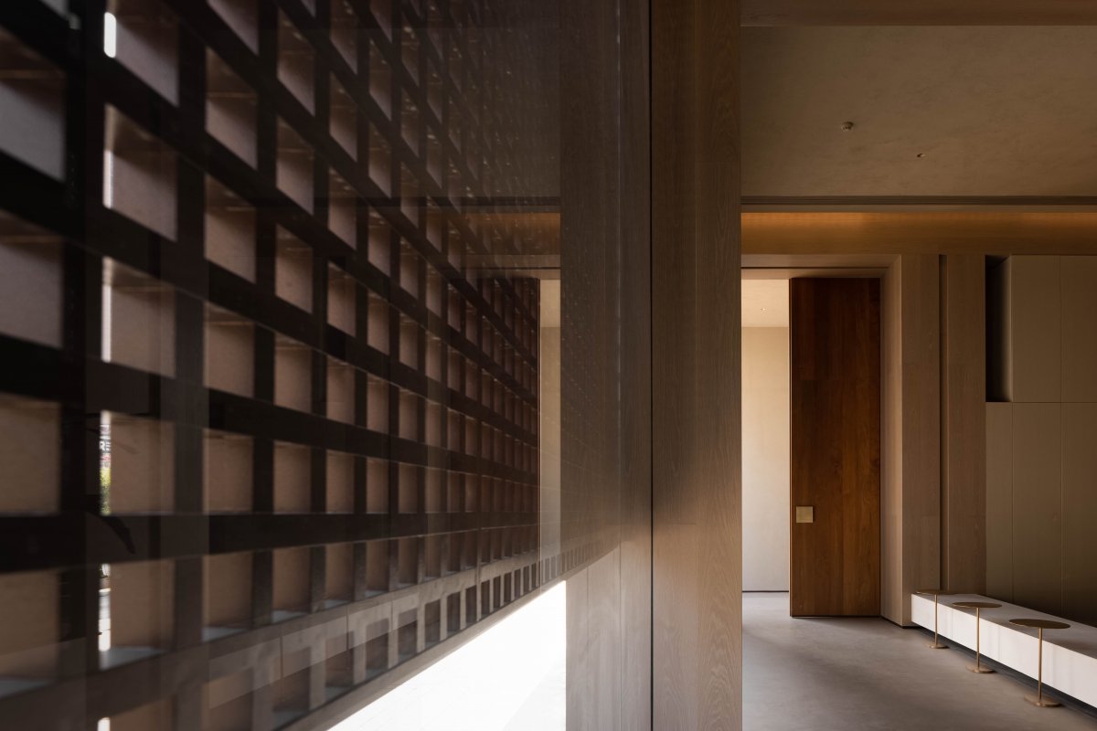
The door head constrains the volume of the building in the proportion of the three-story structure, and the upper geometric bevel opening responds to the actual lighting problems of the second and third floors; The lower part is separated from the column grid and connected with a wooden grid. Based on the visual integrity of the facade, the grid vaguely forms a contrast between the virtual and the real scales. In the obscurity, the essential construction of the function reveals the Oriental natural aesthetics.
Different from the hierarchical order and central axisymmetric layout in the traditional space, the entrance enters from one side. The asymmetrical sense of balance on the facade makes the space flow effectively indoors and outdoors, attracting customers to step up, turn around, then stand, push the door and enter, and establish rhythmic and interesting emotional changes.
Natural Implication
━
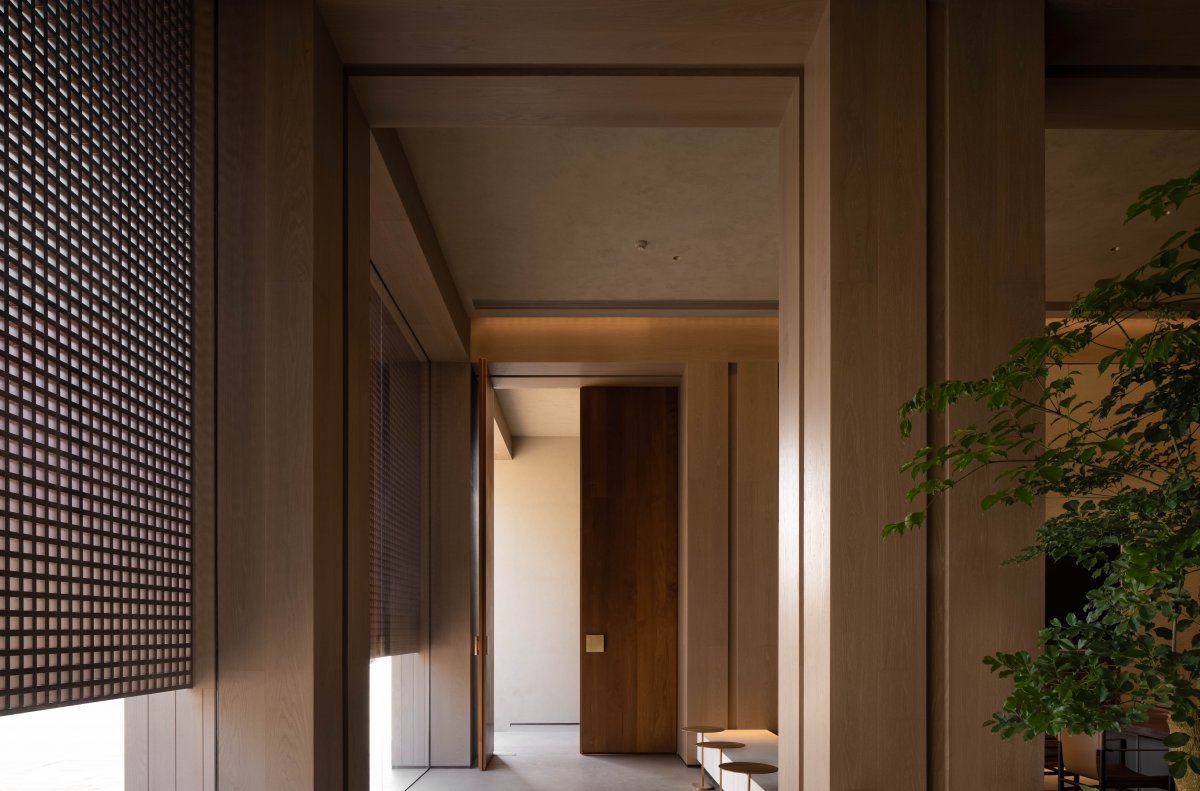
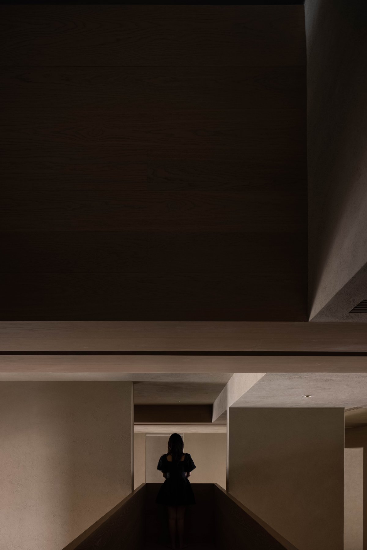
"The corridor was originally designed to promote communication, but it also reduced human contact. The real intention is to promote purposeful and necessary communication, while reducing accidental communication." Robin Evans put forward the thinking of "corridor" in 'Figures, Doors and Passages'. The path design of the vestibule turn back reply not only guides customers to step by step, but also increases the real-time interaction of the gray space.
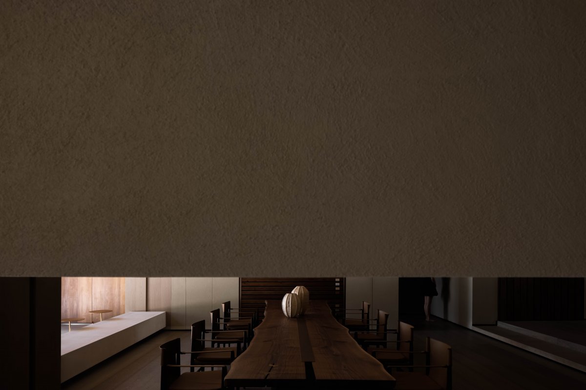
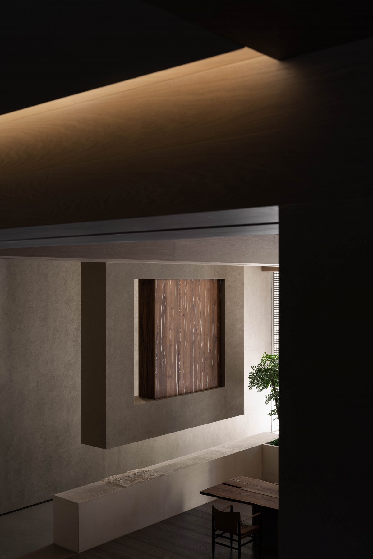
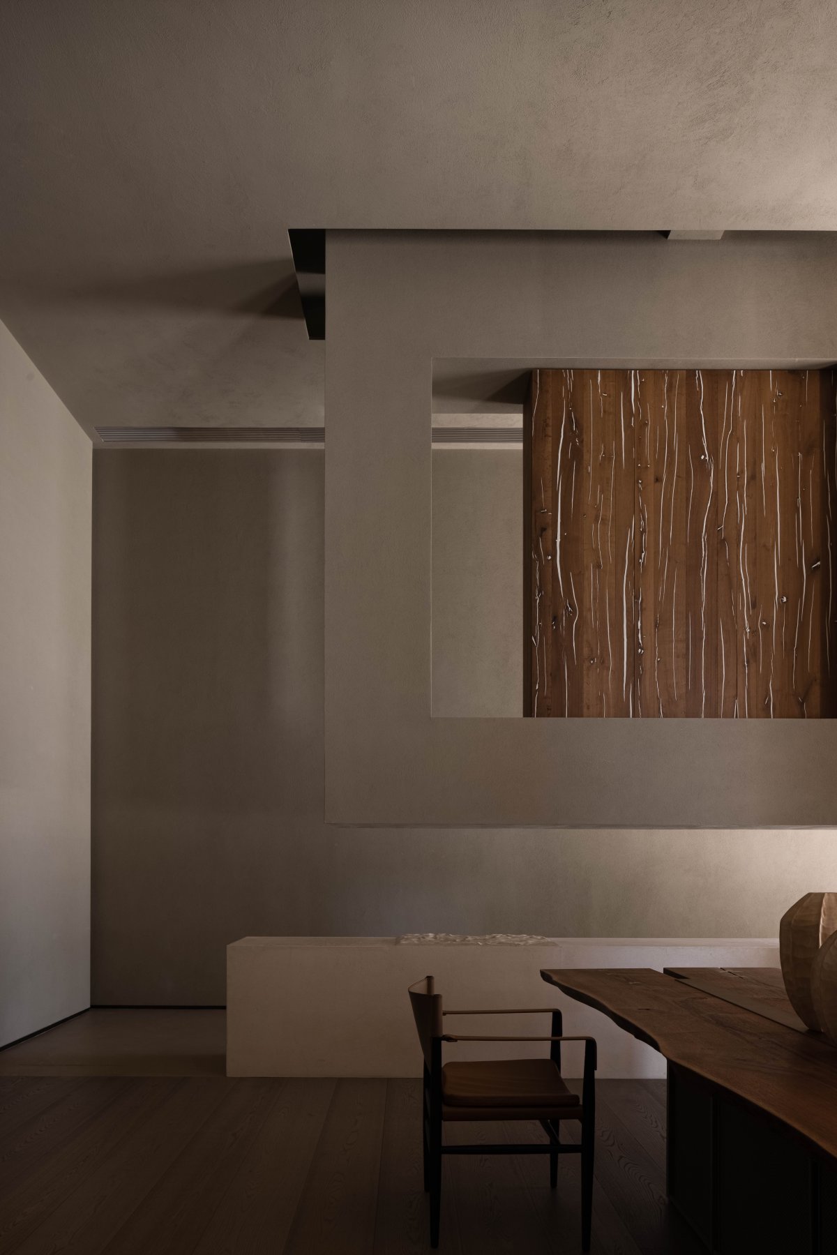
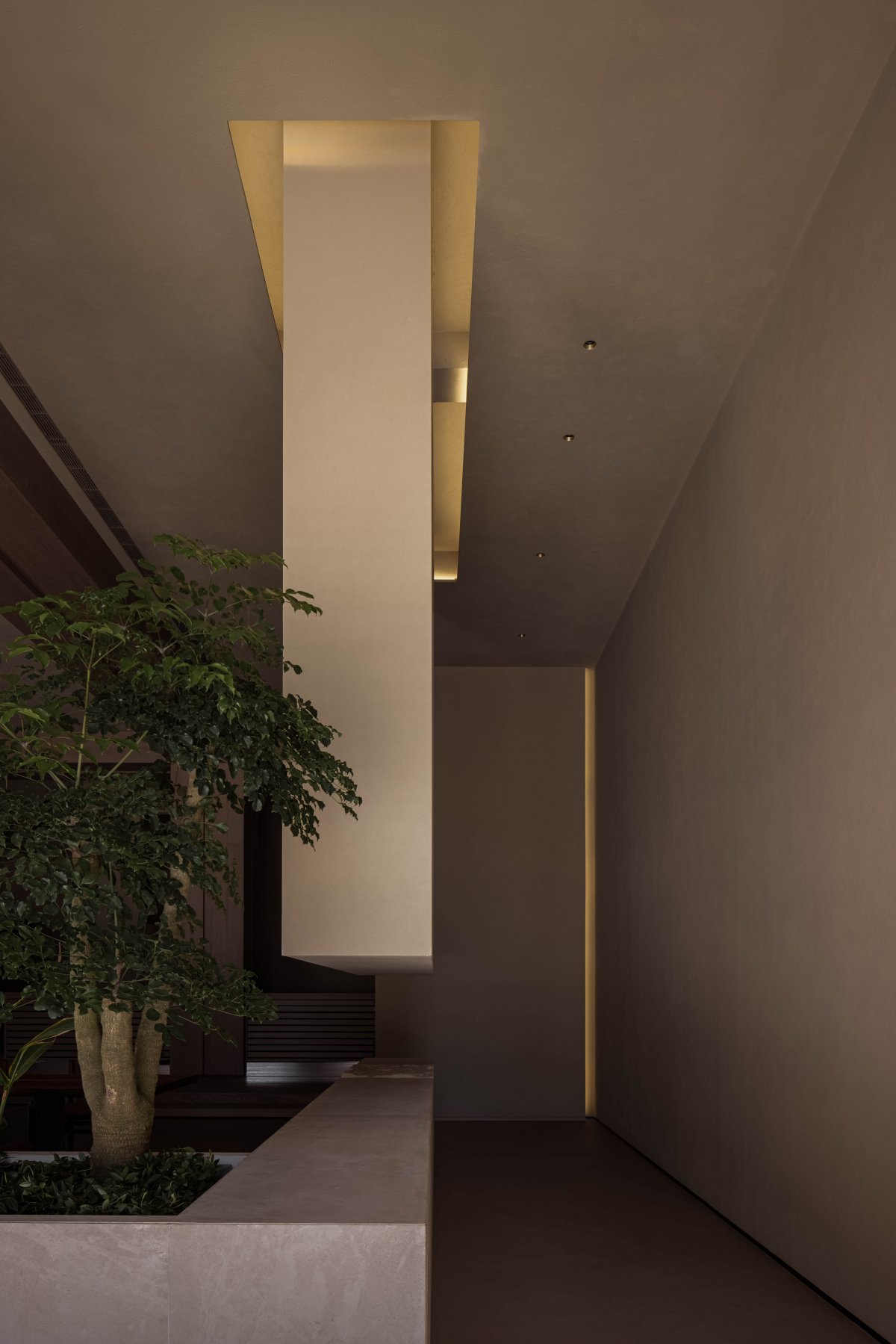
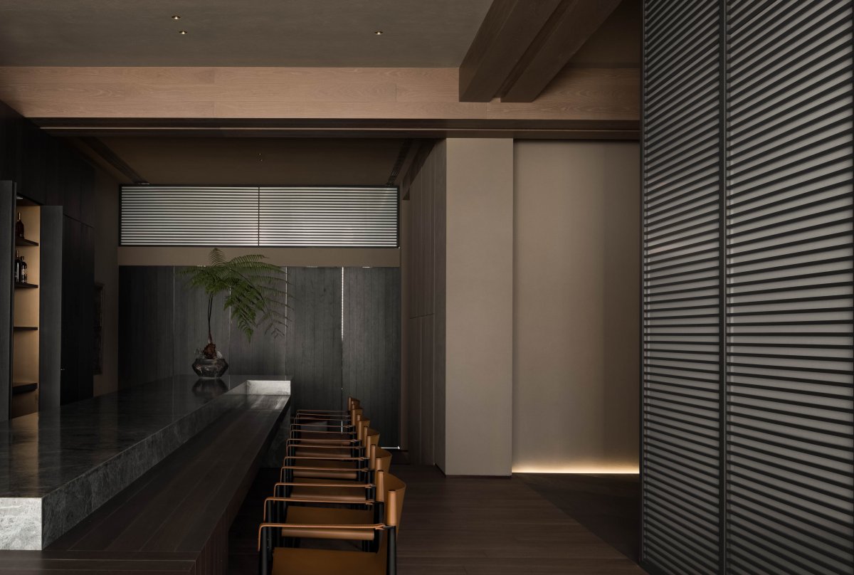
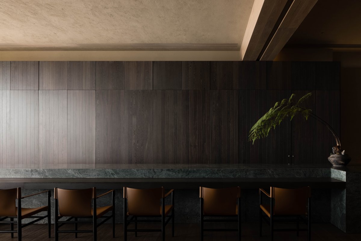
From small to large, the contact area forms an axis relationship with the long table and the display cabinet suspended on the facade. The knee high table from the corridor smoothly transits from the dumb surface to the rippling stone water surface, interspersed with the display of potted green plants and imported log surface materials. Continuity and natural meaning inject fresh vitality into the space.
Way Of Seeing
━
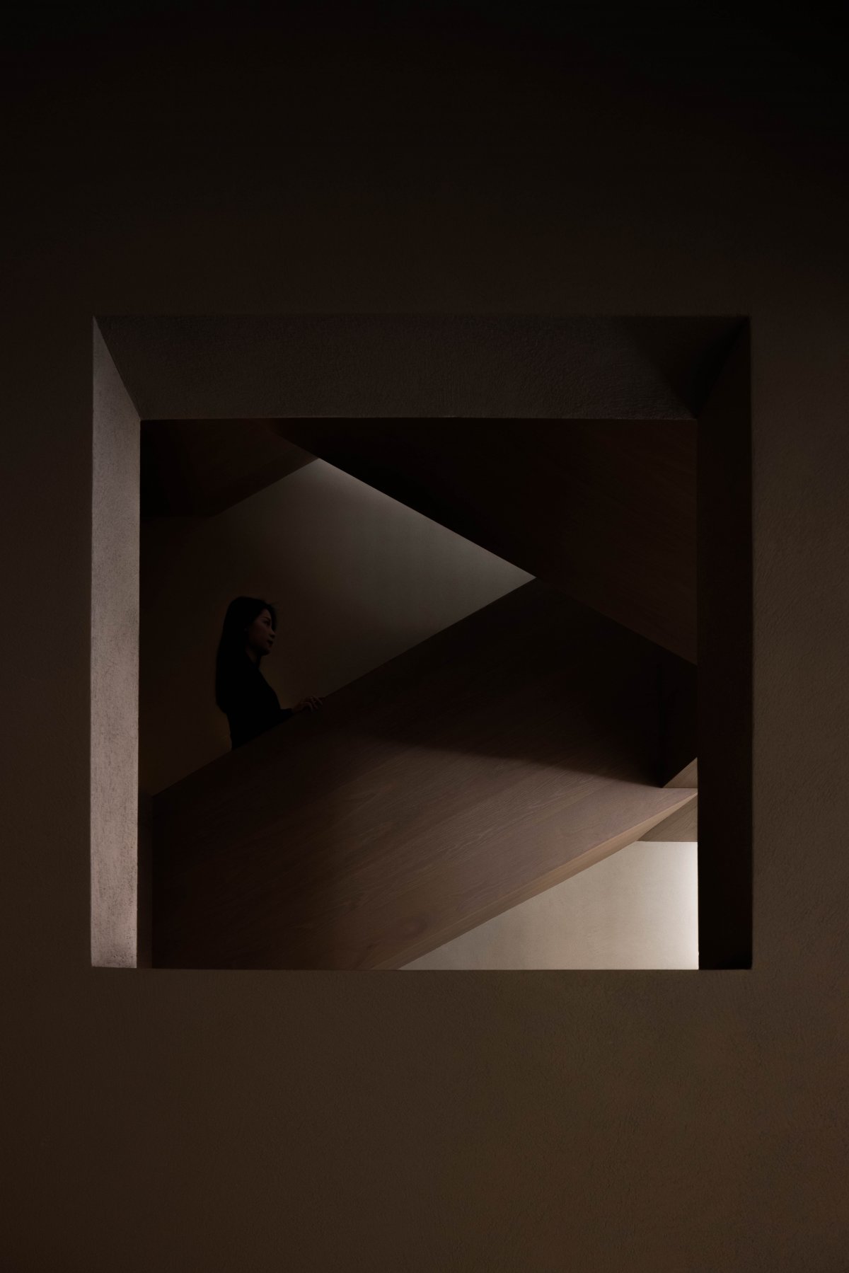
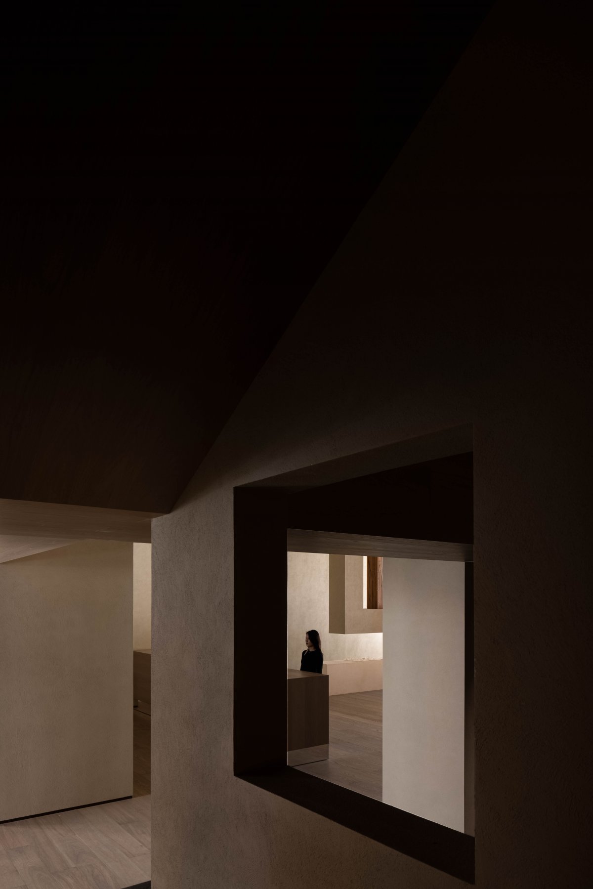
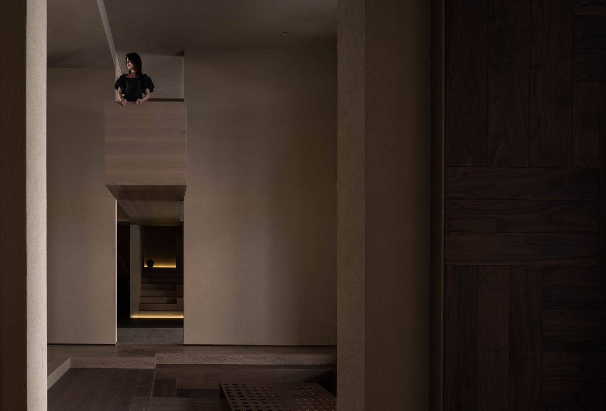
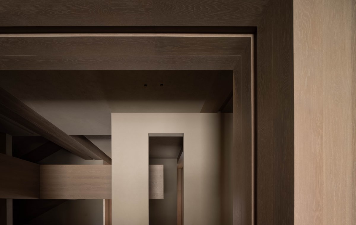
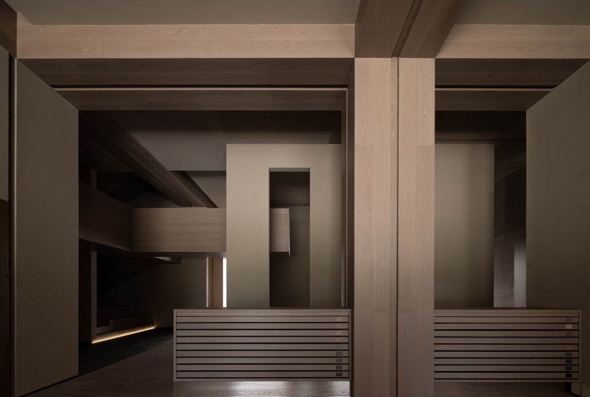
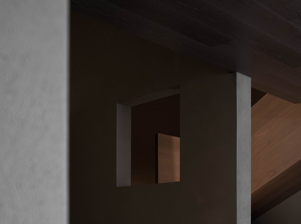
"Look before words." John Berg discusses the priority of vision, emphasizing that "it is viewing that establishes our position in the world around us; we use language to explain the world, but language can not cover up the fact that we are surrounded by the world." When the completely deconstructed "chaos space" is re established in an orderly manner, the crisscross, large and small openings, coarseness and delicacy can be seen in its environment, showing the rich interest of the limited space.
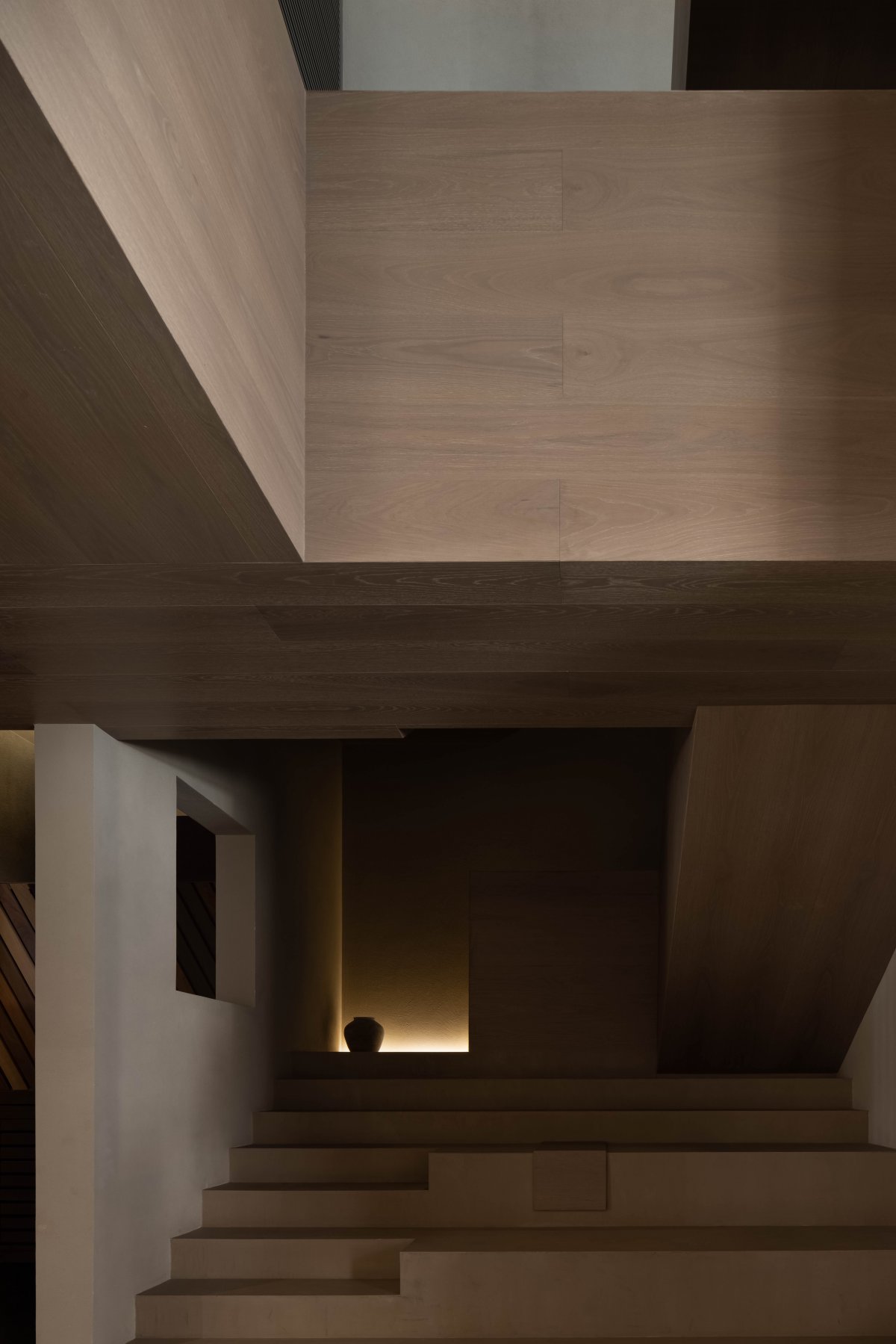
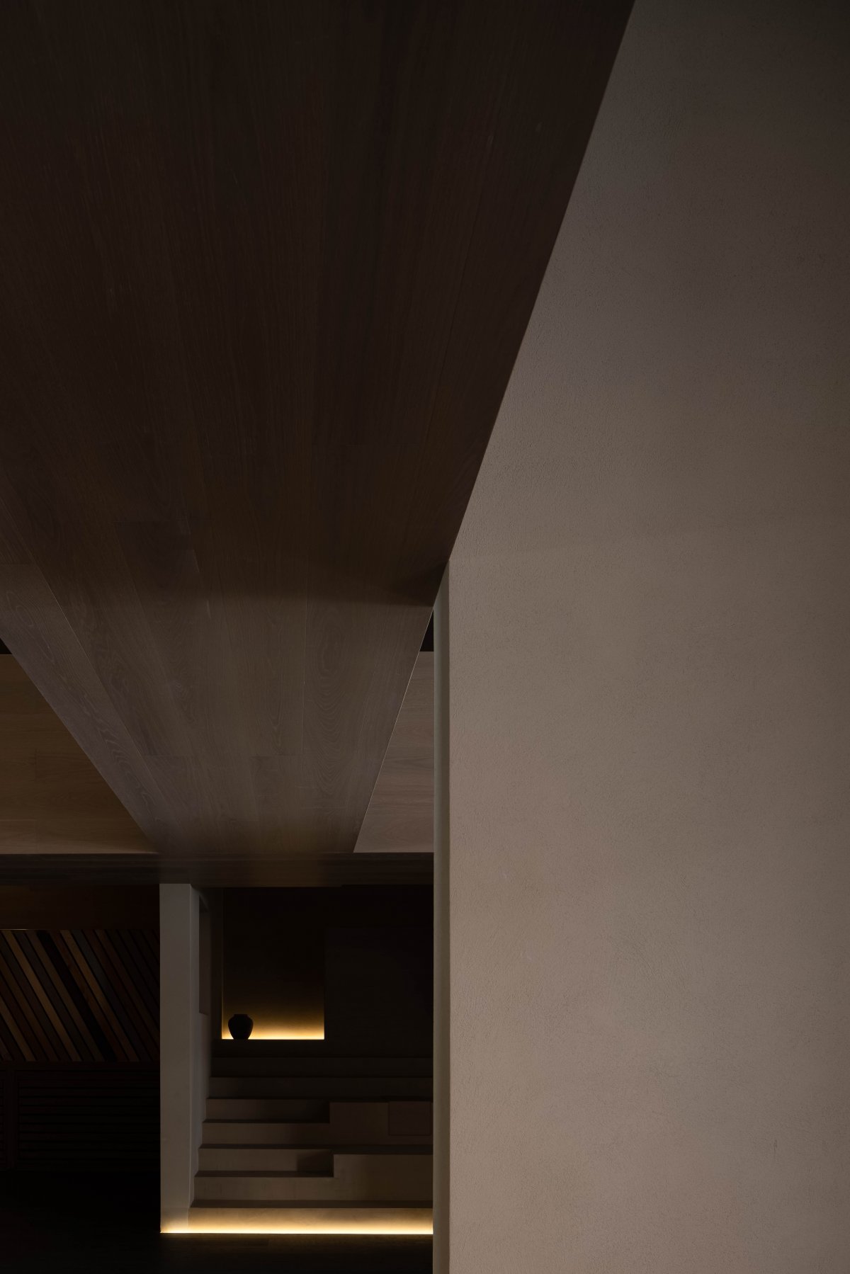
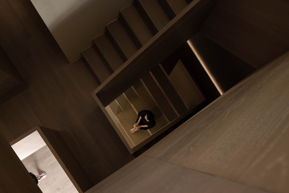
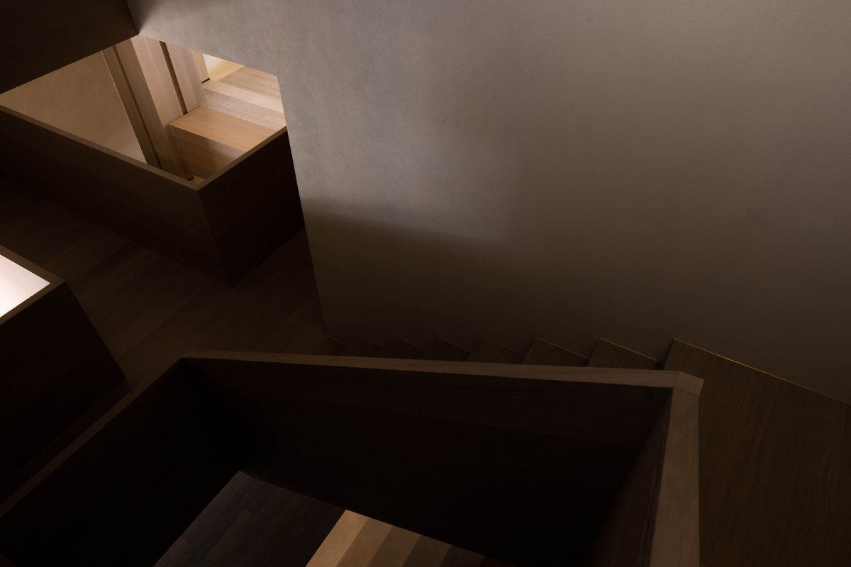
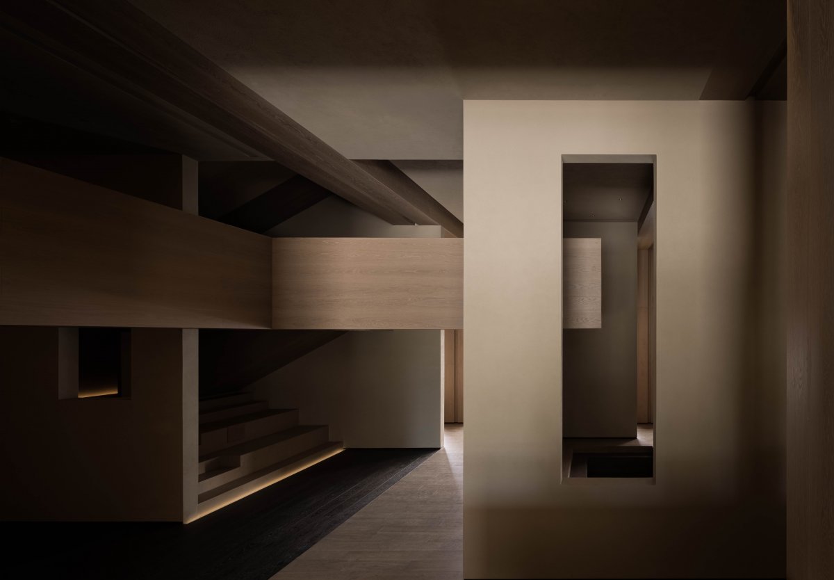
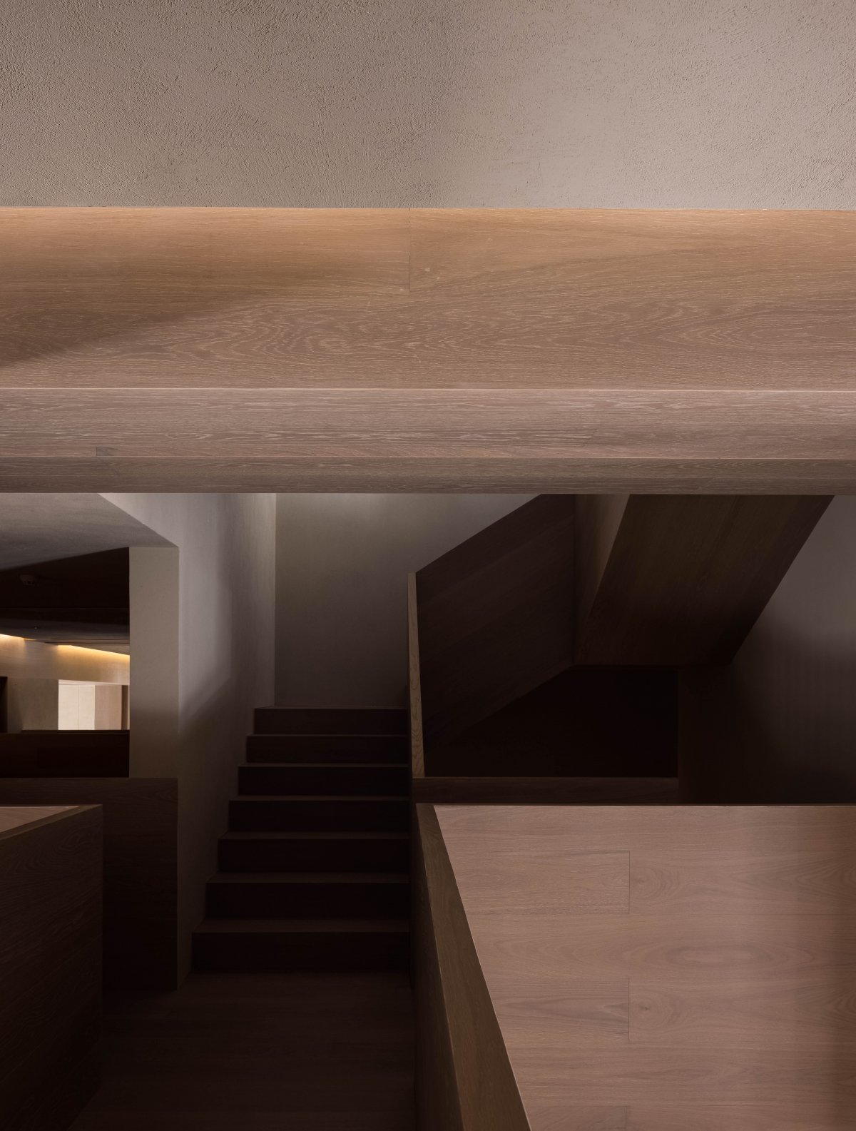
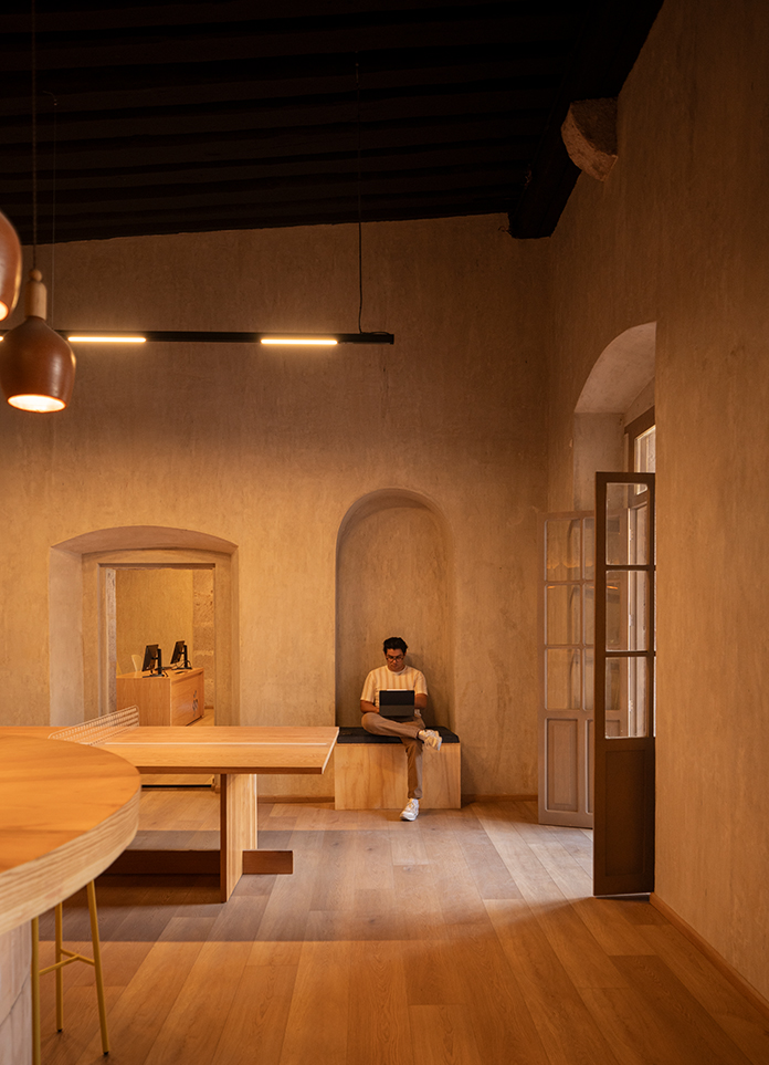
For the exposed beam column structure and functional stairs, from the inside to the outside, the wood floor of the log sheet runs through the whole space with the characteristics of the decorative material itself and being displayed as an exhibit. The original building is 5m high, and the two running stairs normally configured are too cramped to turn back and forth, so a buffer viewing platform between the two came into being.
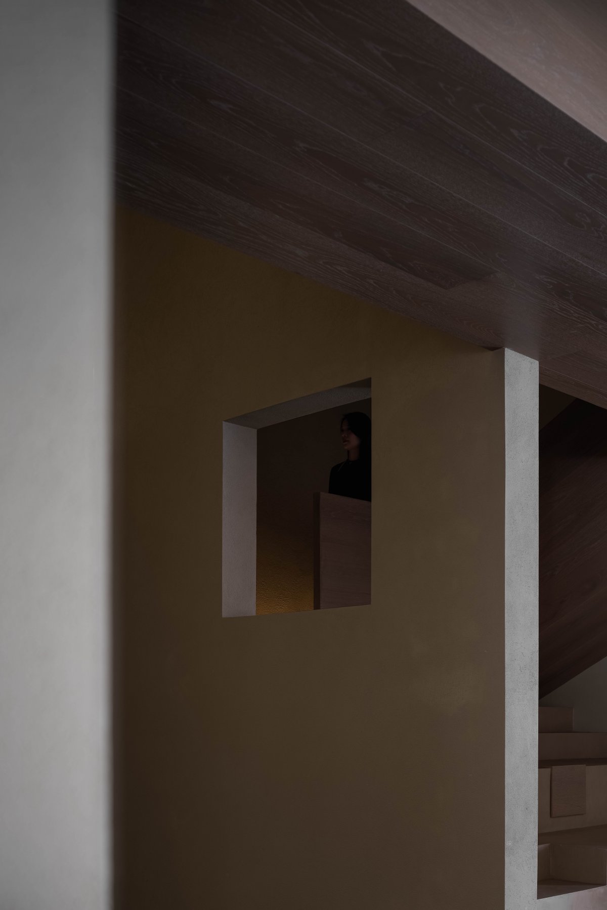
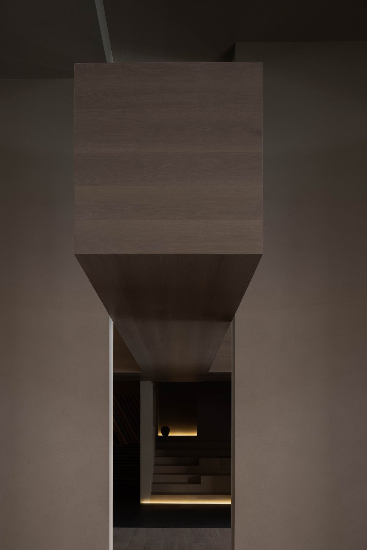
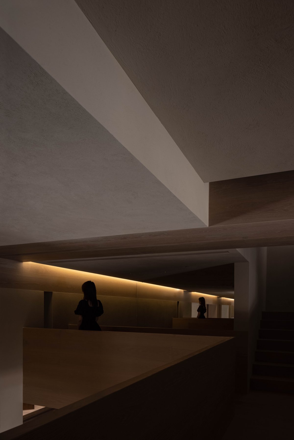
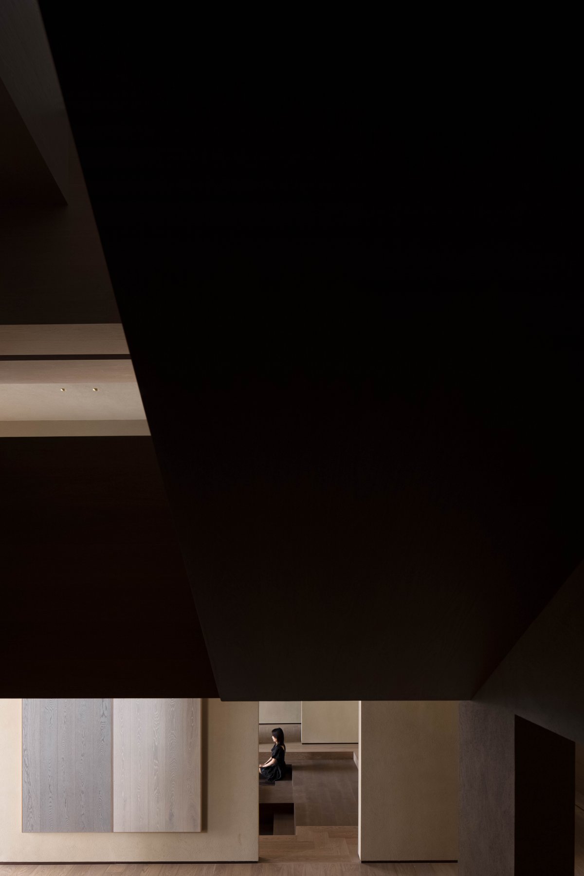
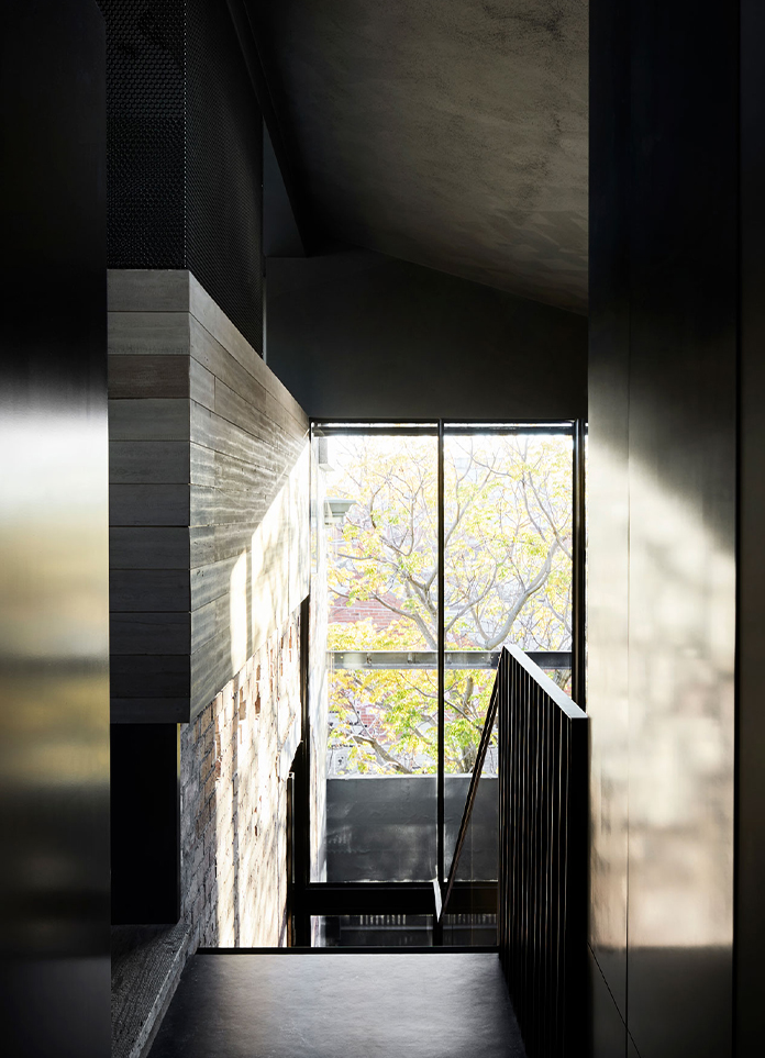
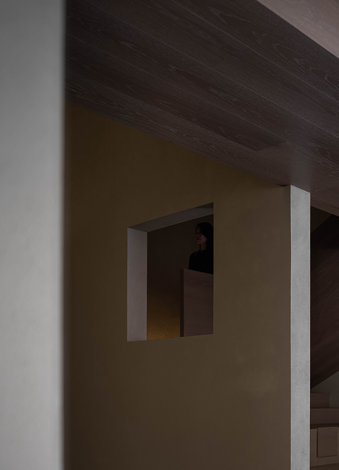
The intersecting blocks penetrate into each other through the interaction of sections, creating a visual linkage at the vertical level. "Seeing" and "being seen" have a "subjective and objective" identity change with the change of scenery. The deep and shallow light and shadow render here, making the space tend to the show of product launch, which is more dramatic and experiential.
The rough texture of wood and paint with prominent texture, as well as the invisible but real wind, air and charm flow in the reconstructed dislocation space, creating a clever artistic conception of "although the wind is not felt, the moon in the water is broken into thousands of pieces". At the same time, the wooden floor stair structure and the sunken exhibition area show more possibilities for solid wood flooring and parquet products.
Gaopeng Banquet
━
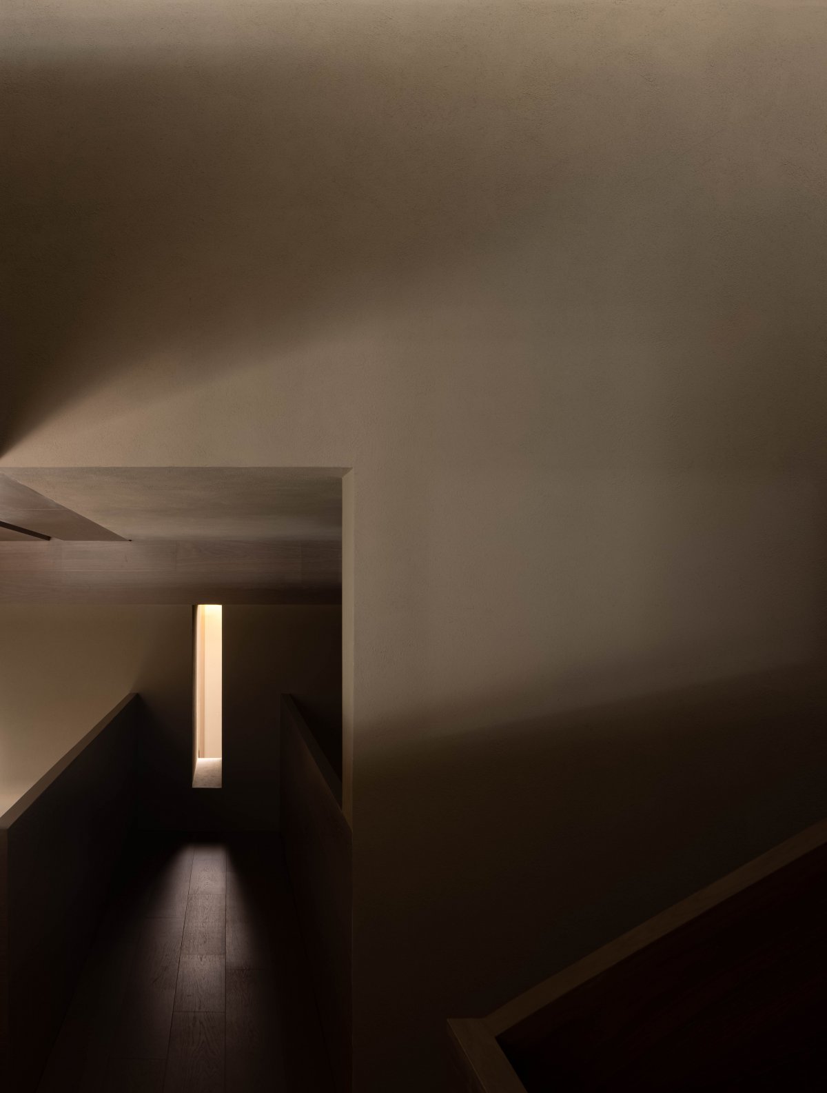
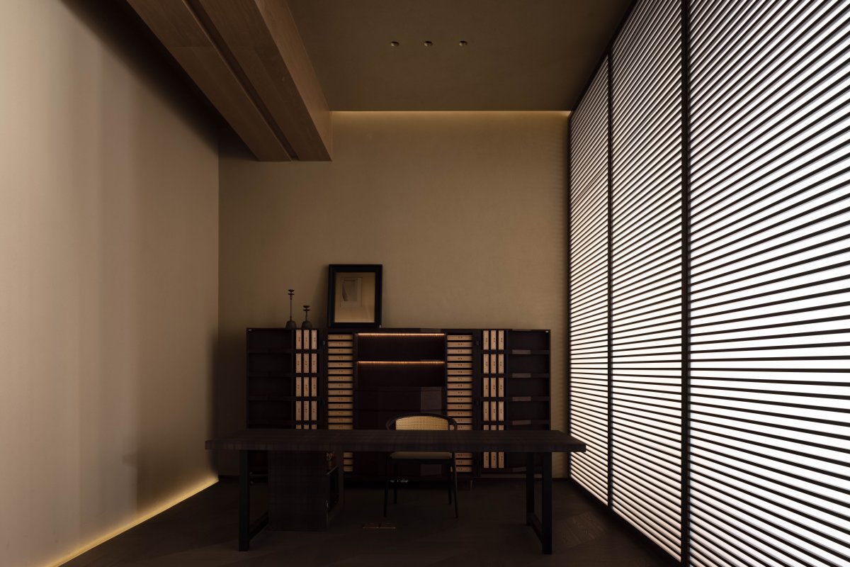
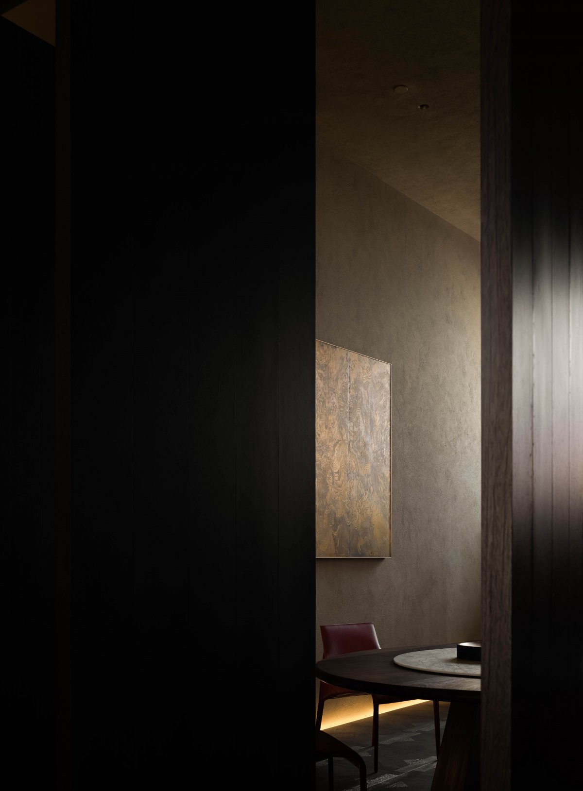
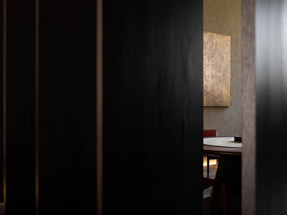
Up to the second floor, the horizontal plane layout has launched the route of double moving line promotion. The wooden grille and paper screen enclose the separated and continuous independent stair area and the tea room on the second floor. The horizontal thin and long wind lines have obvious directionality and enthusiasm, leading to the situation transformation of the body and place from bottom to top.
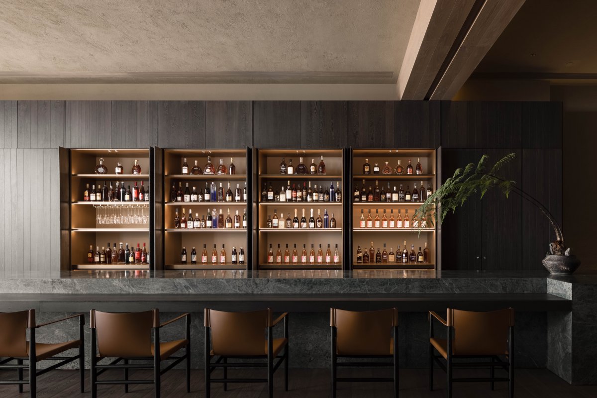
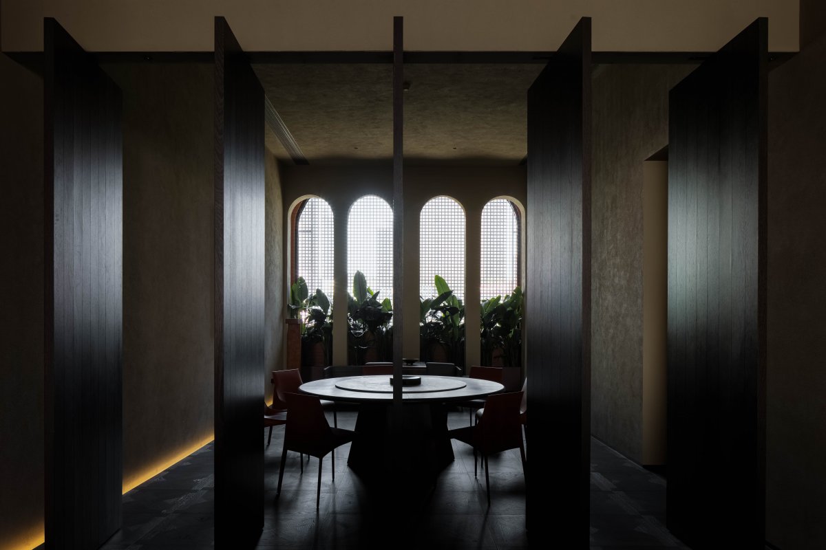
The service island, which bears the main functions, is also used as a gathering bar to meet the daily large-scale lectures or new product release cocktail parties. The "texture of sound" becomes clear and full. The flexible closed revolving shaft door becomes a controllable switch for public and private areas, turning from noisy to quiet.
Temporal Meaning
━
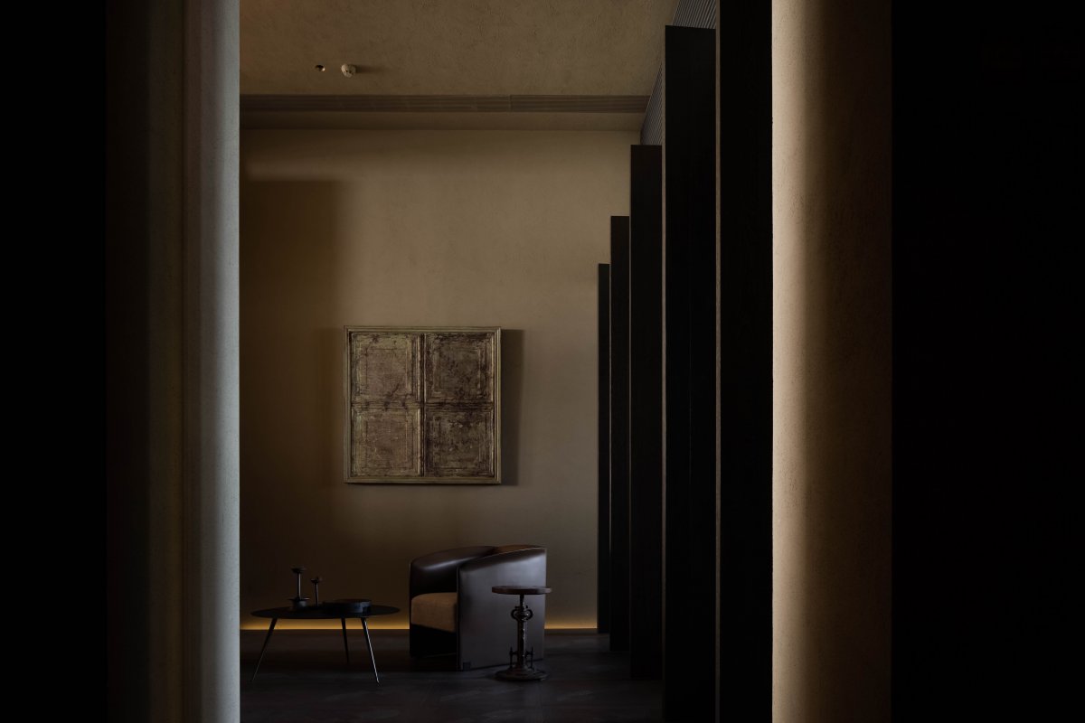
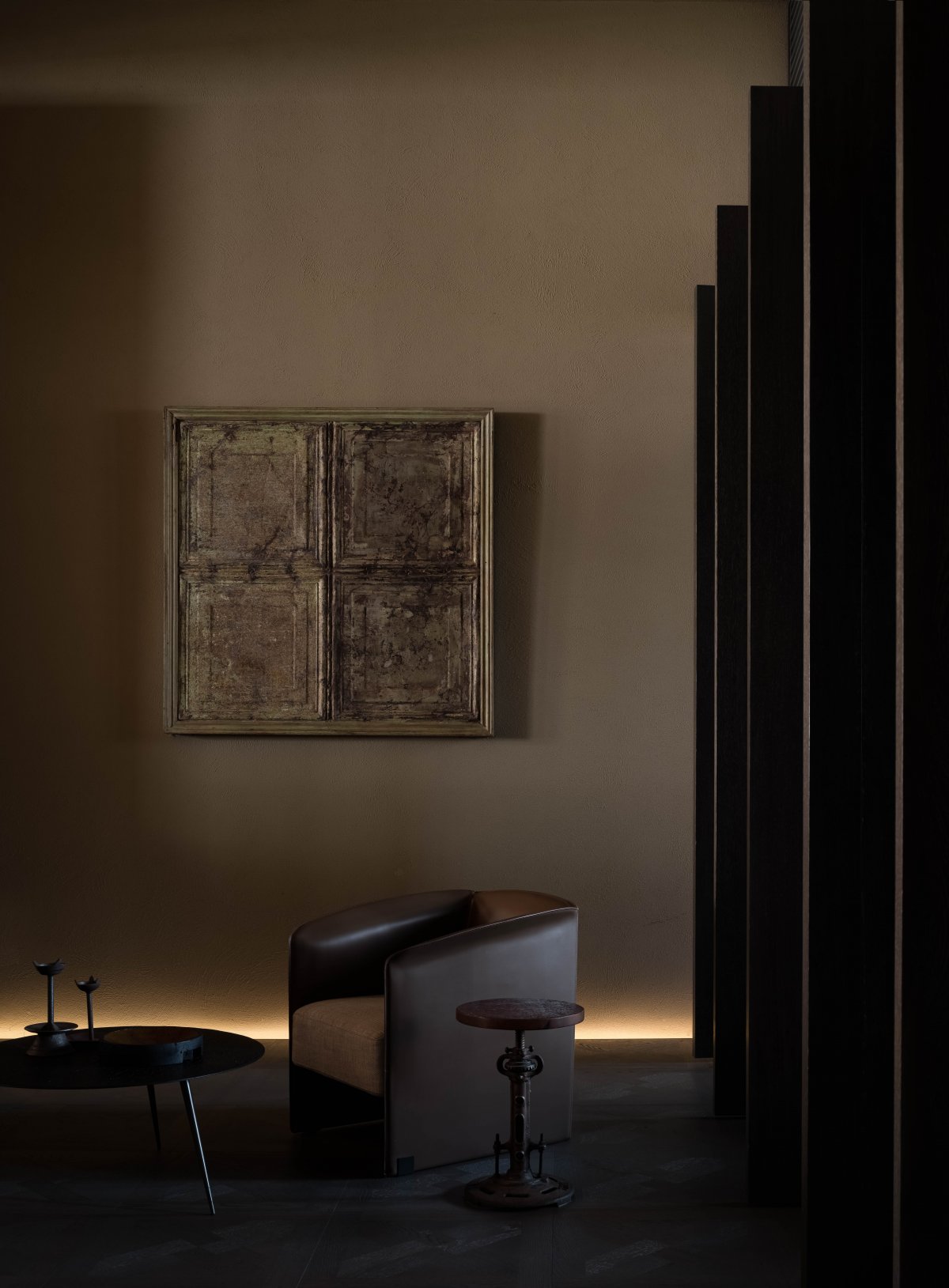
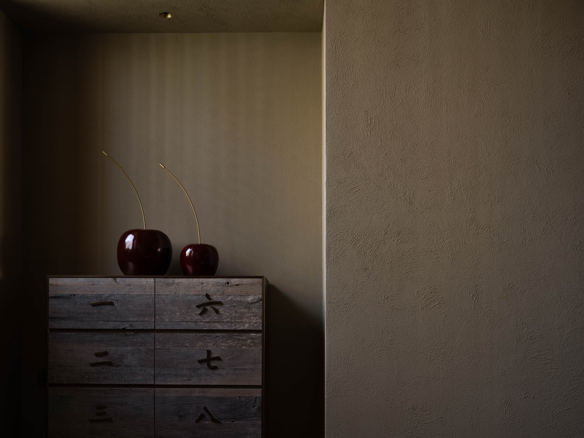
In the KUANGYI flooring experience store, in addition to the exploration of "naturalness", the expression of "timeliness" is equally important. After years of woodwork, stone, bronze and textural paint, the surface has a physical subtle reaction, accumulating the legacy and traces of time, emitting emotional temperature and unique charm.
"Natural lifestyle" is a metaphor and a brand pursuit. In terms of design, space is only the carrier of products, avoiding unnecessary human intervention and making it true, exposing the original, unmodified and full of true natural materials. We perceive nature because the mutual forces, in turn, are also perceived by nature.
- Interiors: Wen Zhiguo / SSD
- Photos: Ouyang Yun
- Words: Off-Words / Moon
