How Department
Not to the trend, style, aesthetics as the basis of thinking, but beyond the design thinking to express the attitude of life -- Xiao Yizhan
The most gentle buyer of the shop left because of Xixi. The owner, who has returned from studying abroad, has a high aesthetic taste, vision and pioneering consciousness. He also has his own unique ideas and opinions on brand setting: unique, natural, clean and sustainable. He pursues good design that can stand the test of time. What designers need to do is to create a space that is relaxed and creative enough for young people to feel freely.
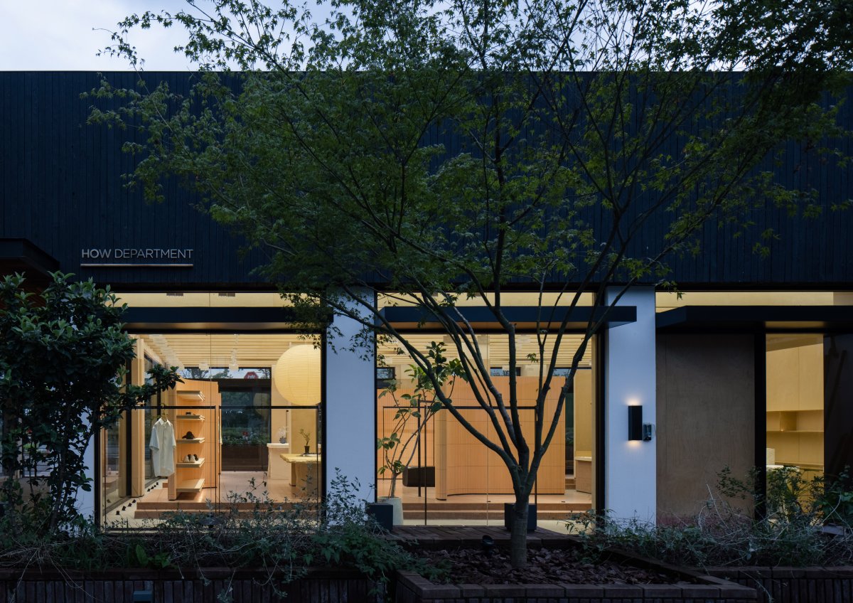
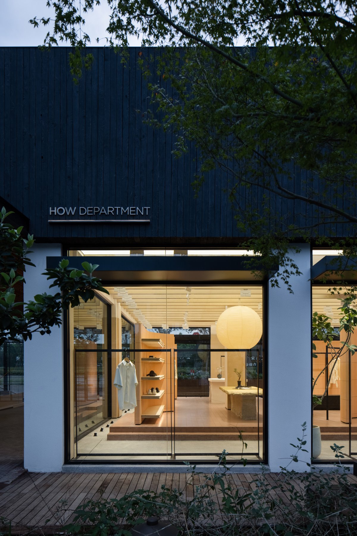
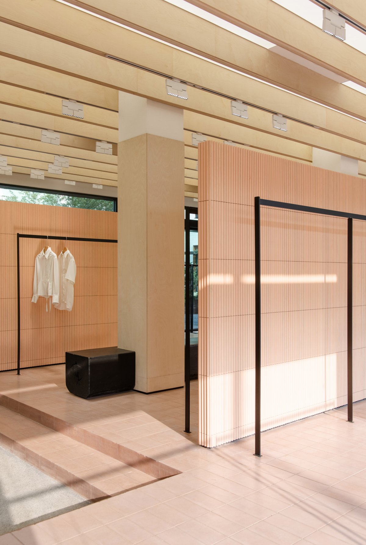
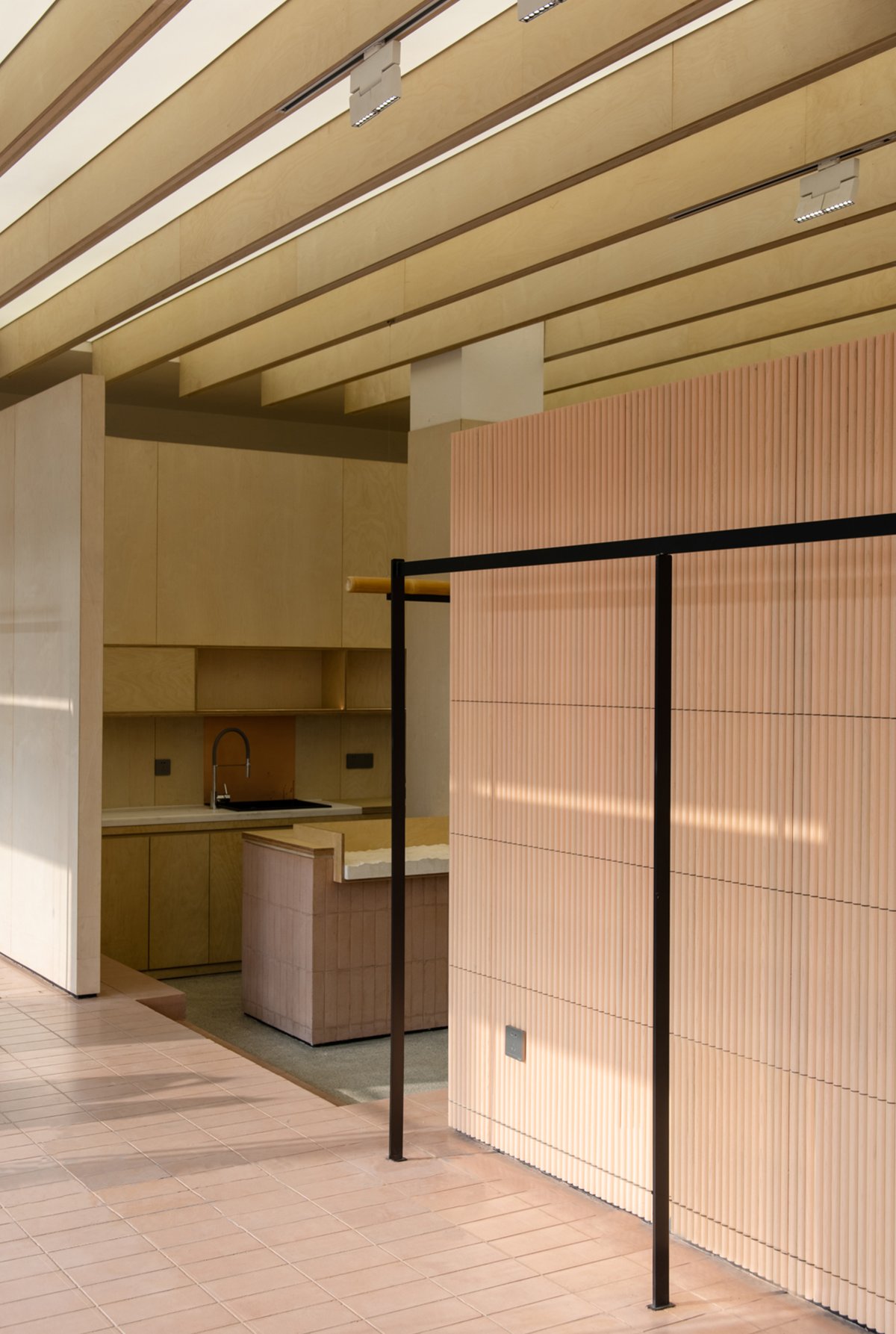
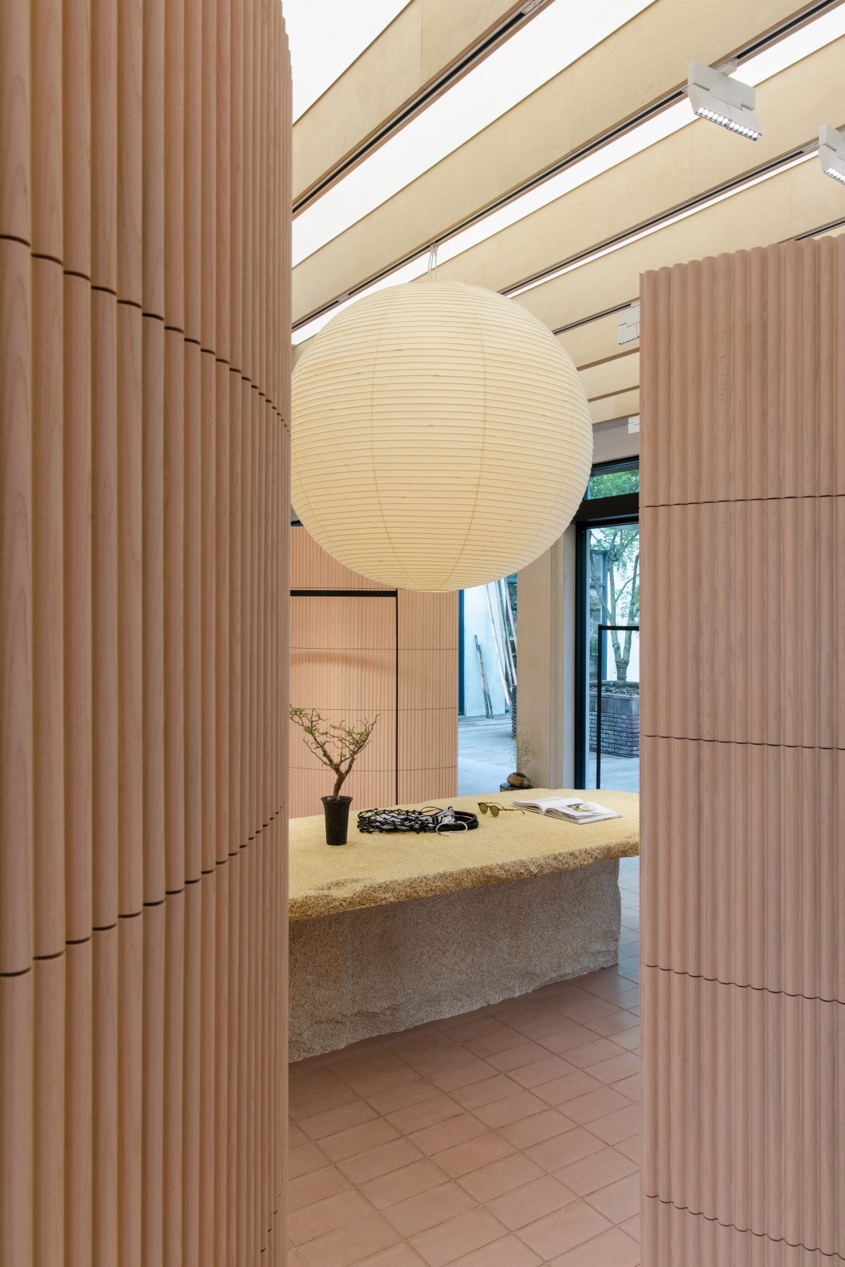
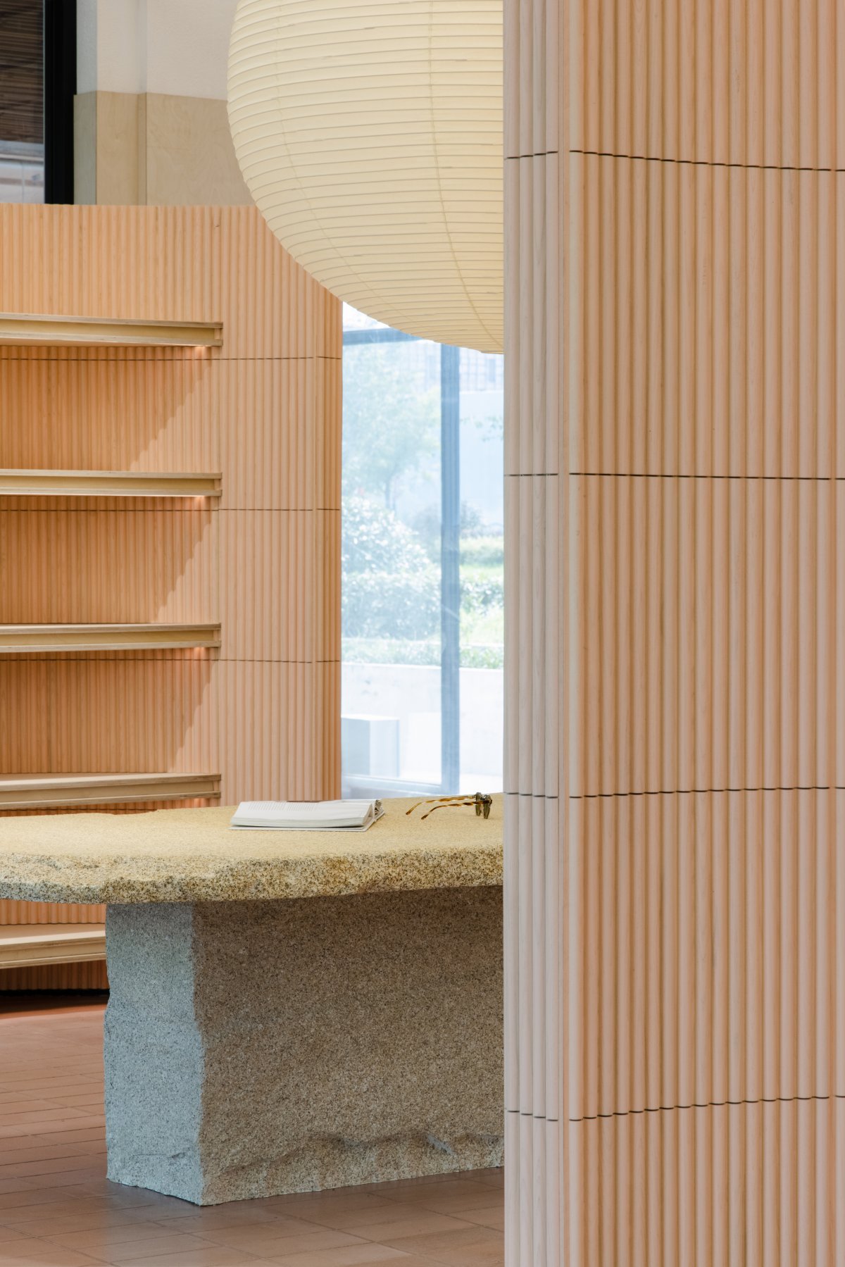
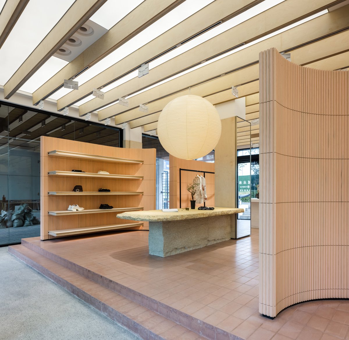
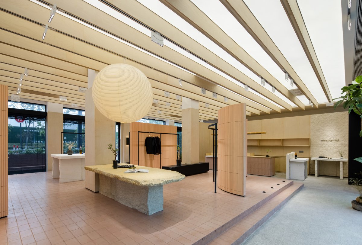
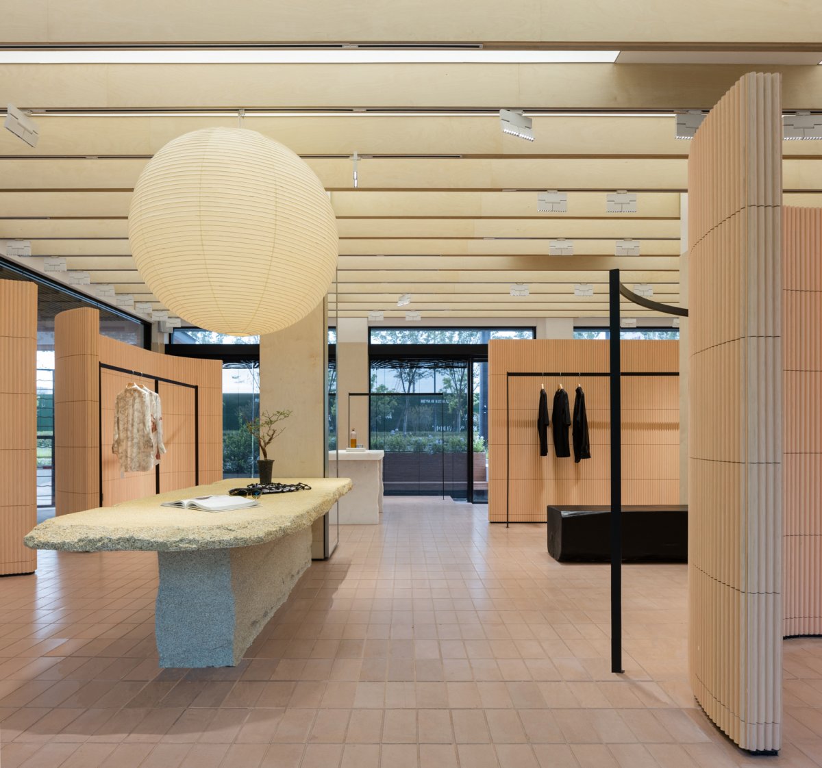
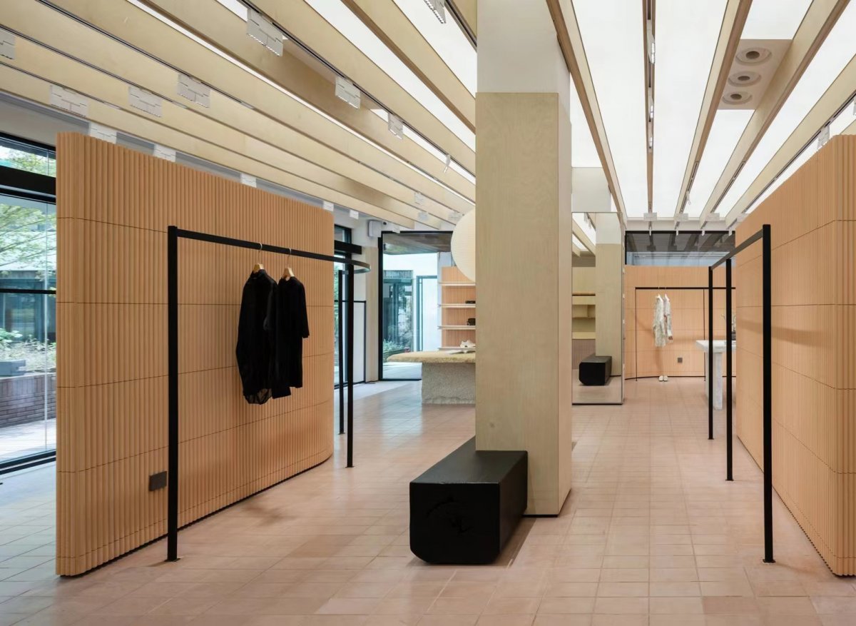
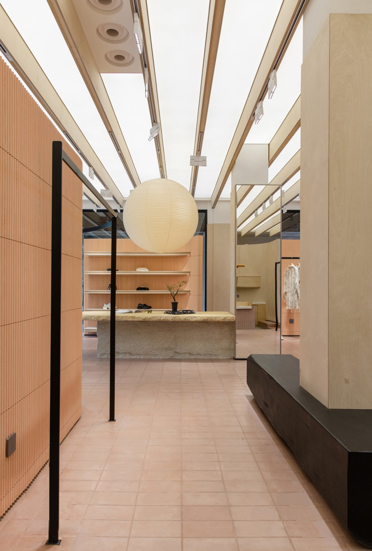
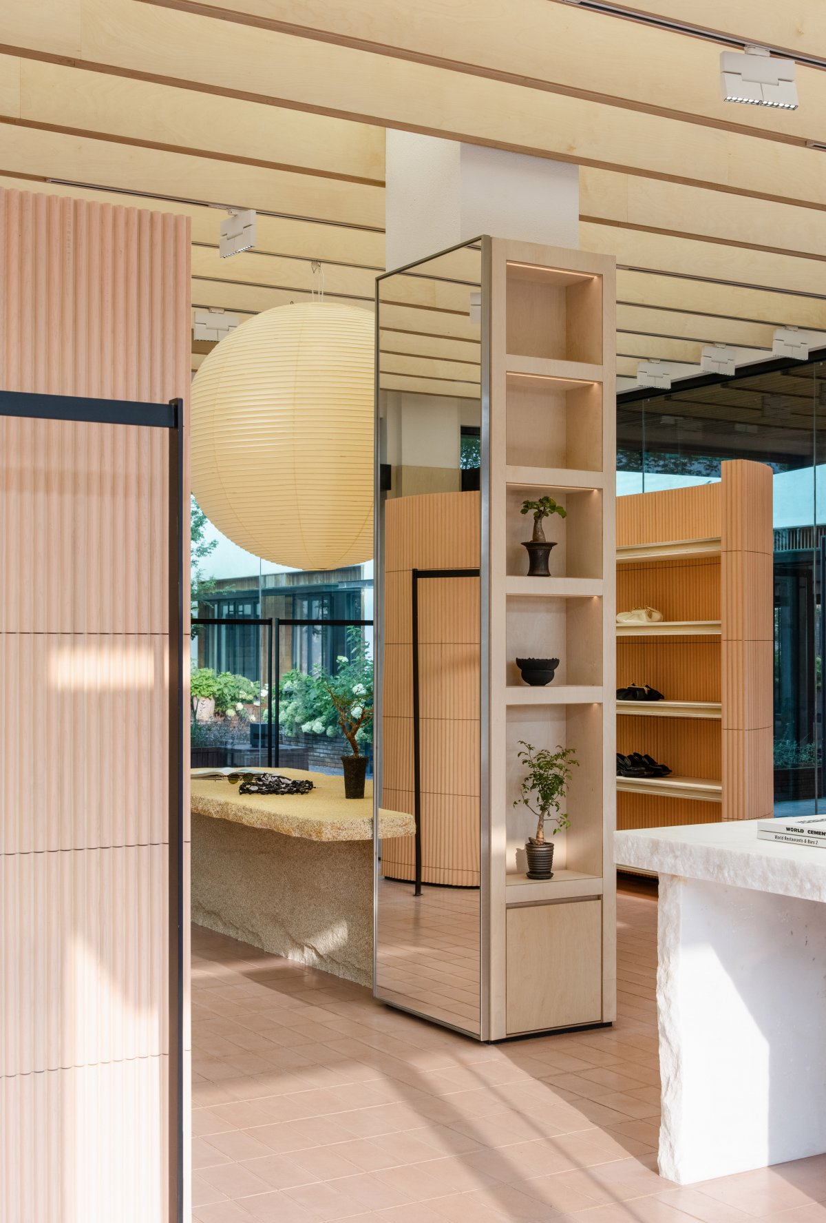
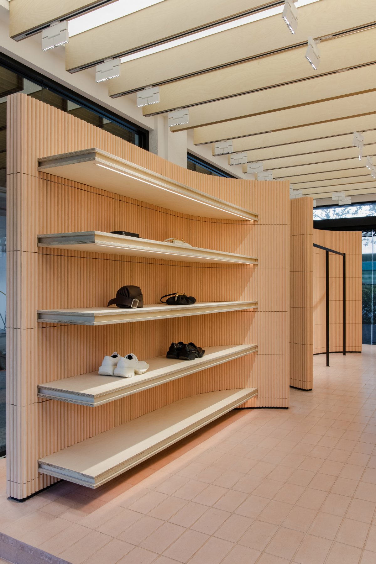
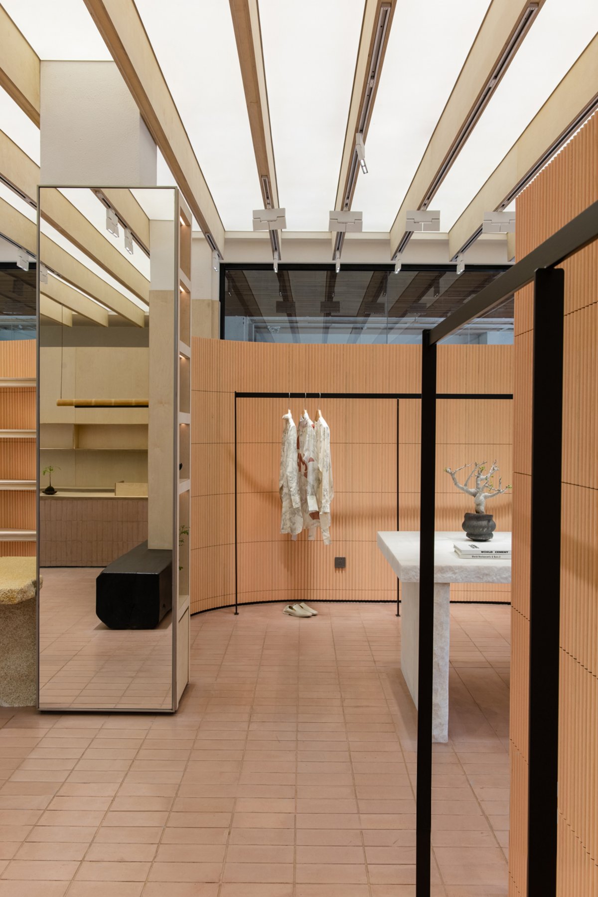
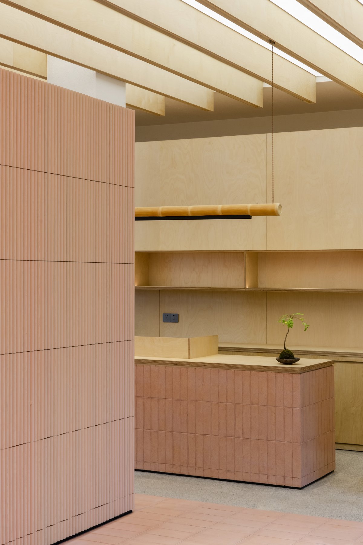
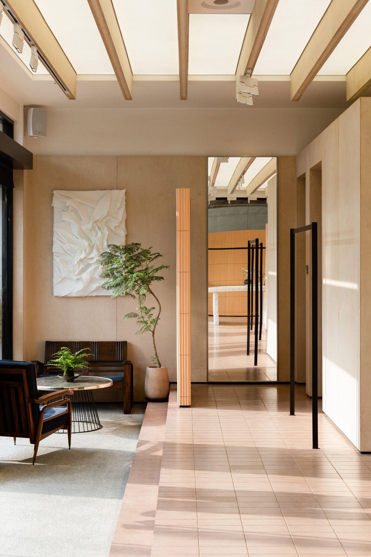
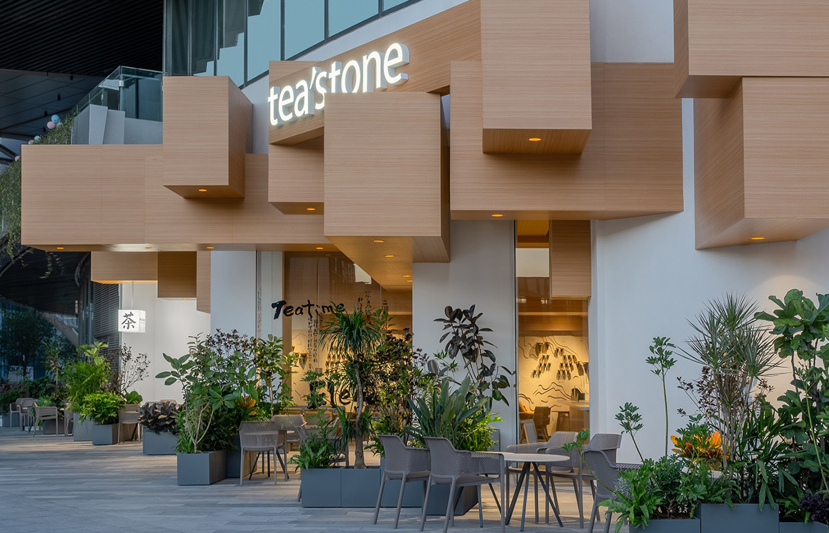
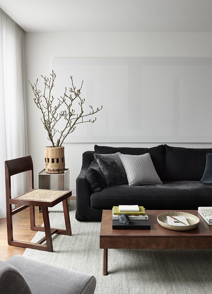
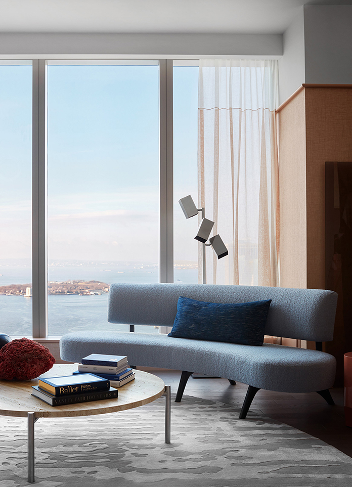
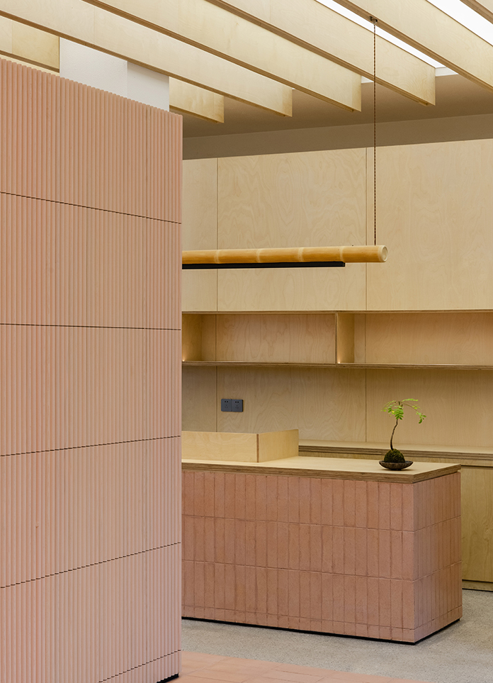
The design of the door head is like the finishing touch, which makes everyone passing by curious and fascinated. The three floor-to-ceiling Windows create a unique shopping scene of HOW DEPARTMENT through the light and shadow in different periods of time. The interior uses low saturation color to create brand texture and temperature sense. Starting from the brand concept and functionality, the design draws inspiration from the spatial structure and uses simple wood lines to reconstruct installation elements, forming a unique visual language system of the brand.
Different from nowadays various web celebrity style, stylist wants to build a new integrated experience space, for young people to the aesthetic standard of pop art, fashion item, select one of the world's most attitude through different ways of ZhanChen, inspiration and trend for people to share cutting-edge fashion clothing culture, passing out of the way of life, To the culture, feelings, fashion, ideal and other issues of care and consideration. It also conveys a more youthful attitude towards life.
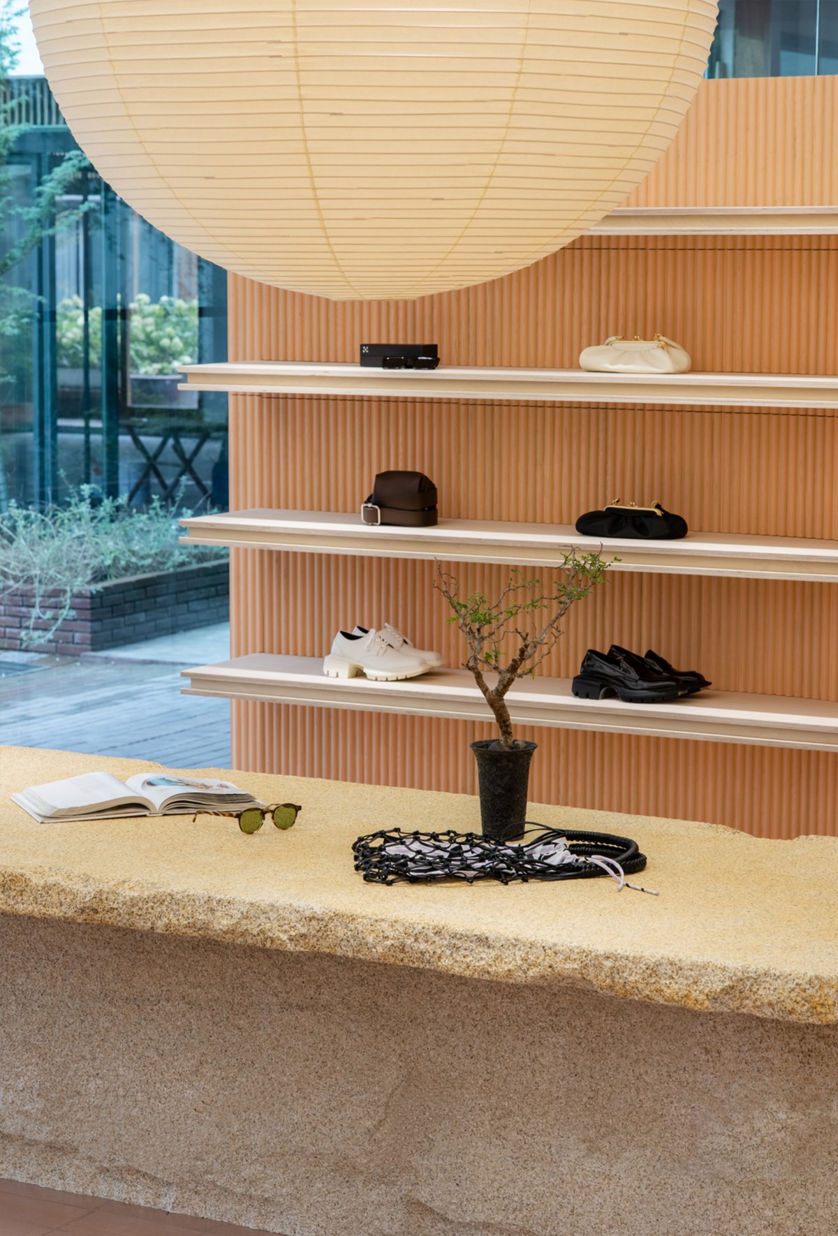
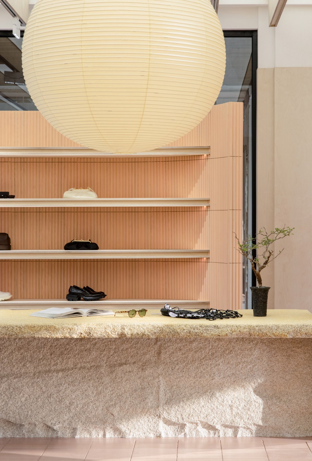
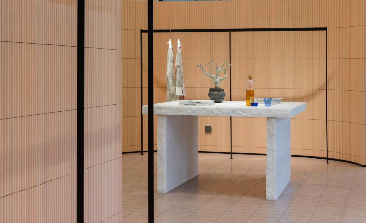
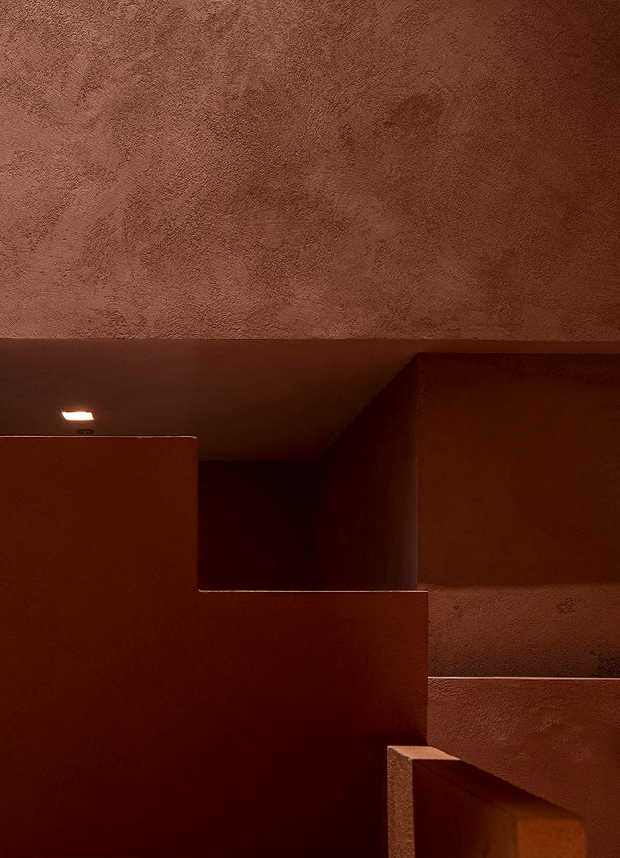
Stylist uses the processing means of stone material, reach the lasting appeal restoring ancient ways that red brick brings, composed a natural overture in exquisite. The whole block of granite is forged out of the texture of rough and powerful, vivid shape activated the gentle environment, to create a subtle sense of harmony. Flowing air and changing light and shadow are all part of the design. Finally, an uninterrupted narrative space is created between nature and city, scene and people, past and future.
Commodity is the protagonist of space, and space, as an extremely inclusive container, not only maintains the independent personality of commodity, but also does not lose space to serve the essence of human. The installation structure on display is distributed in the space in the form of sequence, connecting the functional lines with each other. When all goods are displayed in the space, the personality and concept of the brand are conveyed to each consumer in the most real and perceptible form.
In the face of Z generation consumers who pursue novelty and are good at social media, a buyer should not only maintain fashion, personality and experience, but also cater to their differentiated needs. Designers take space as the stage, commodities as props, around the brand propositions, focusing on the design to shape the "personality" of commercial space, to convey to consumers a kind of independent from the trend of self attitude. The design concept of HOW DEPARTMENT is related to the city, fashion and inner expression. Instead of just selling goods, it is more a warm interpretation of the fashion attitude of urban life. Compared with most of the industry eager to achieve, HOW DEPARTMEN brand concept is HOW to slow down the time through design, stay on good things, and fully enjoy the comfortable time of selective selection in the process of space.
- Interiors: Yizhan Interior Design
- Photos: Liu Yujie
