Pippa's Apartment
A man goes all over the world to find what he wants, and finds it in his home. --- Moore
The downtown house was not designed and operated according to any particular style or trend. From the layout of the living room and dining room to the unconventional treatment of the children's room and bedroom, they are unique and customized. Pippa herself said: This is the private custom she wants for her life. The whole design starts from the customer's personal life and needs, the owner's unique work habits make her need a multi-functional space layout integrating work, leisure and learning. She hopes to add more possibilities in her home life.
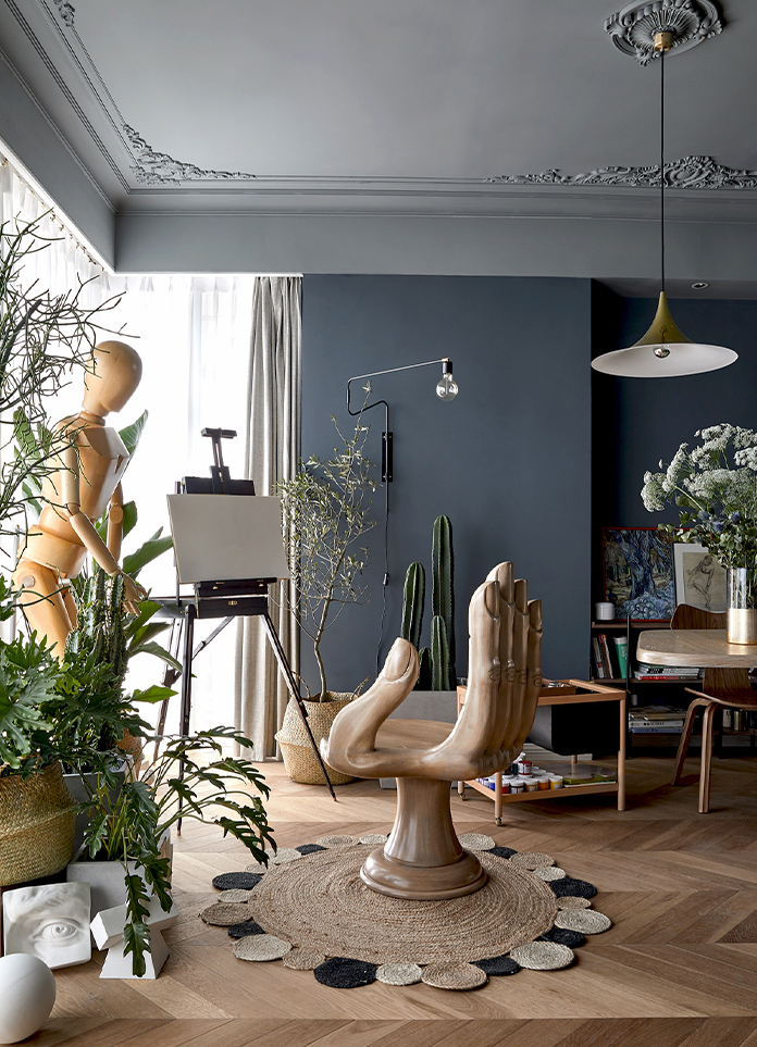
First of all, the designer abandoned the traditional sofa layout of the living room and turned it into a more open style. The art collection of customer is reorganized into different installation art. The decorative paintings at the end of the corridor combine with the artist's sculpture, formed a unique and flexible interior art landscape. Thonet, Pantone chairs, Eames, Series 7 and Grand Prix Chairs in the living room look out of the window at a distance from the cityscape, illuminated by the abundant sunlight.
Drawing and private rest area is the most favorite place for the owner to stay at home. This is arranged as a natural paradise for art. Sunlight enters through the panoramic window, and outdoor trees can be seen at any time through the French windows. She said that no matter whether she was painting or resting, she could calm her thoughts down. The combination of marble and wooden roof cabinets separates the living room, and a wall-mounted music player hangs above the marble-made electronic fireplace, spreading melodious music throughout the house.
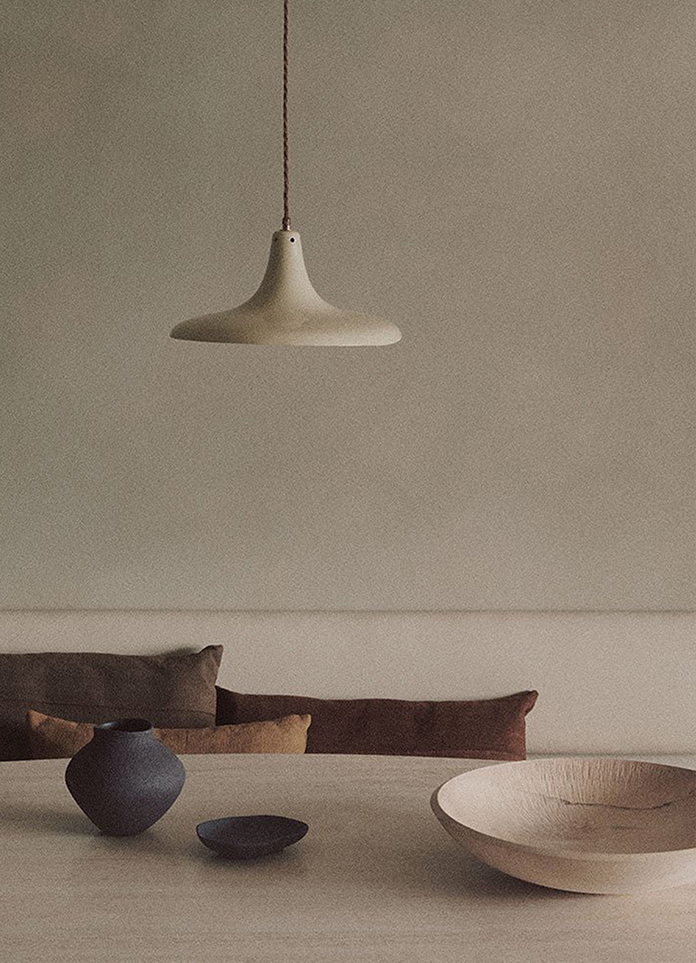
The restaurant has an interesting mini bar, and most of the storage space is used for clothes and books. We adjusted the layout of the restaurant and set up different areas to create different attractions: entrance lobby, multi-purpose area, kitchen area, corridor and straw hat chandelier above the restaurant, from Petite friture vertigo Pendant, France. On one side of the dining hall is an amazing collection of old kitchen utensils from all over the world, from the knife for digging nuts to the knife for cutting pizzas to the rope for fixing turkeys when roasting turkeys. They are more like artworks than tools.
Unlike the tone of the overall metallic sensation, children's rooms are warm and soft. On the top of the roof there is also a three-dimensional light cloud, which gives the child full imagination and dream.
The contrast between the modern and classical elements of the master bedroom brings a typical delicate life style, in sharp contrast to the objects, furniture and works of art in the space. The participation of plants creates the freshness of urban forests and memories of warm wood.
The owner will replace the bedclothes with different colors according to season and mood. A thin Oluce mushroom table lamp on both sides of the bedside is contrasted with the Louis Poulsen brass lamp. Contrary to the typical windowless bathroom, the bathroom is located on one side of the master bedroom and is relatively open, so it is part of the bedroom. If you need privacy, then you can close the bedroom door, bathroom space with the master bedroom and living balcony connected, you can feel the fresh external air. Most of the designs of the wardrobes without landing look lighter, and the whole space does not appear to be cramped. All works of art are customized by artists and hidden in different areas to suit the different sensory needs of the family.
- Interiors: Muxin Studio
- Photos: Zhang Daqi


