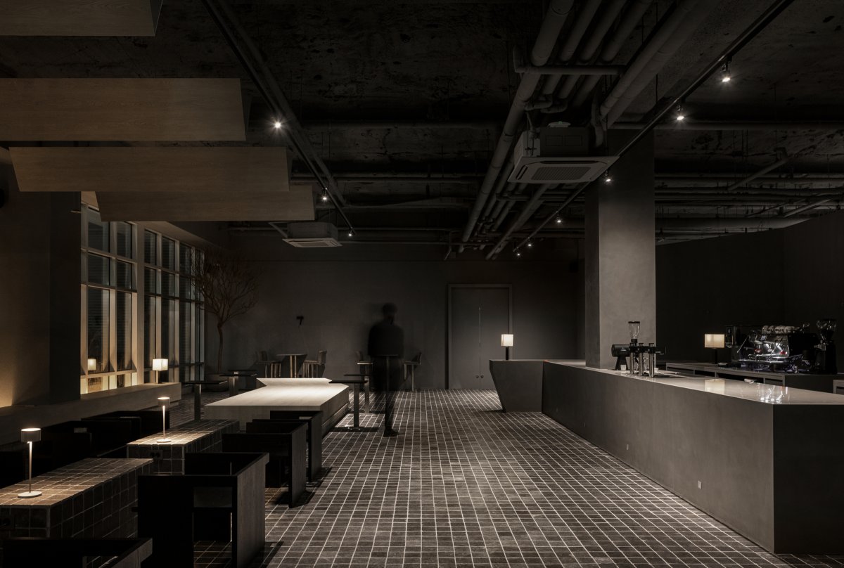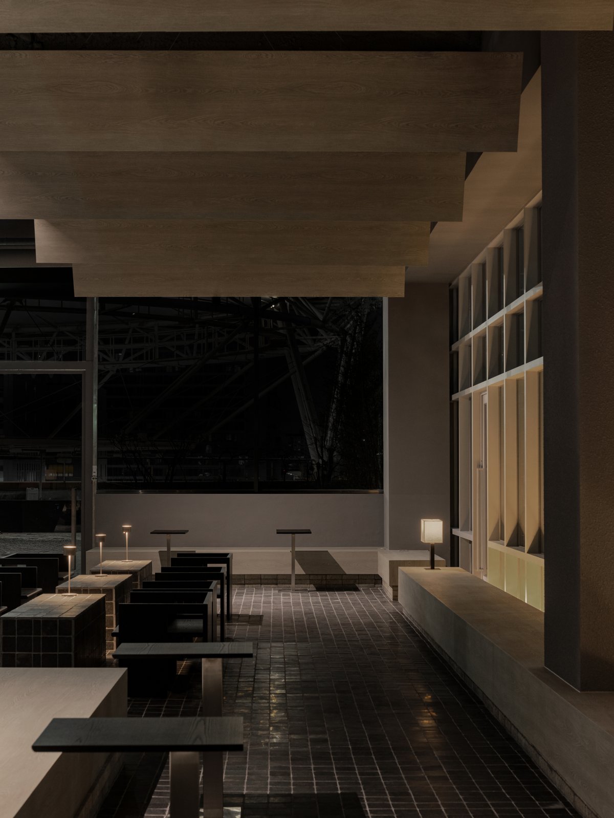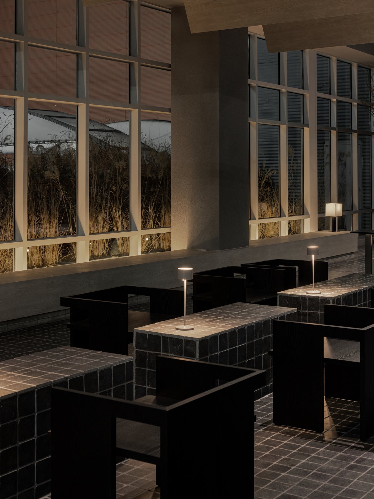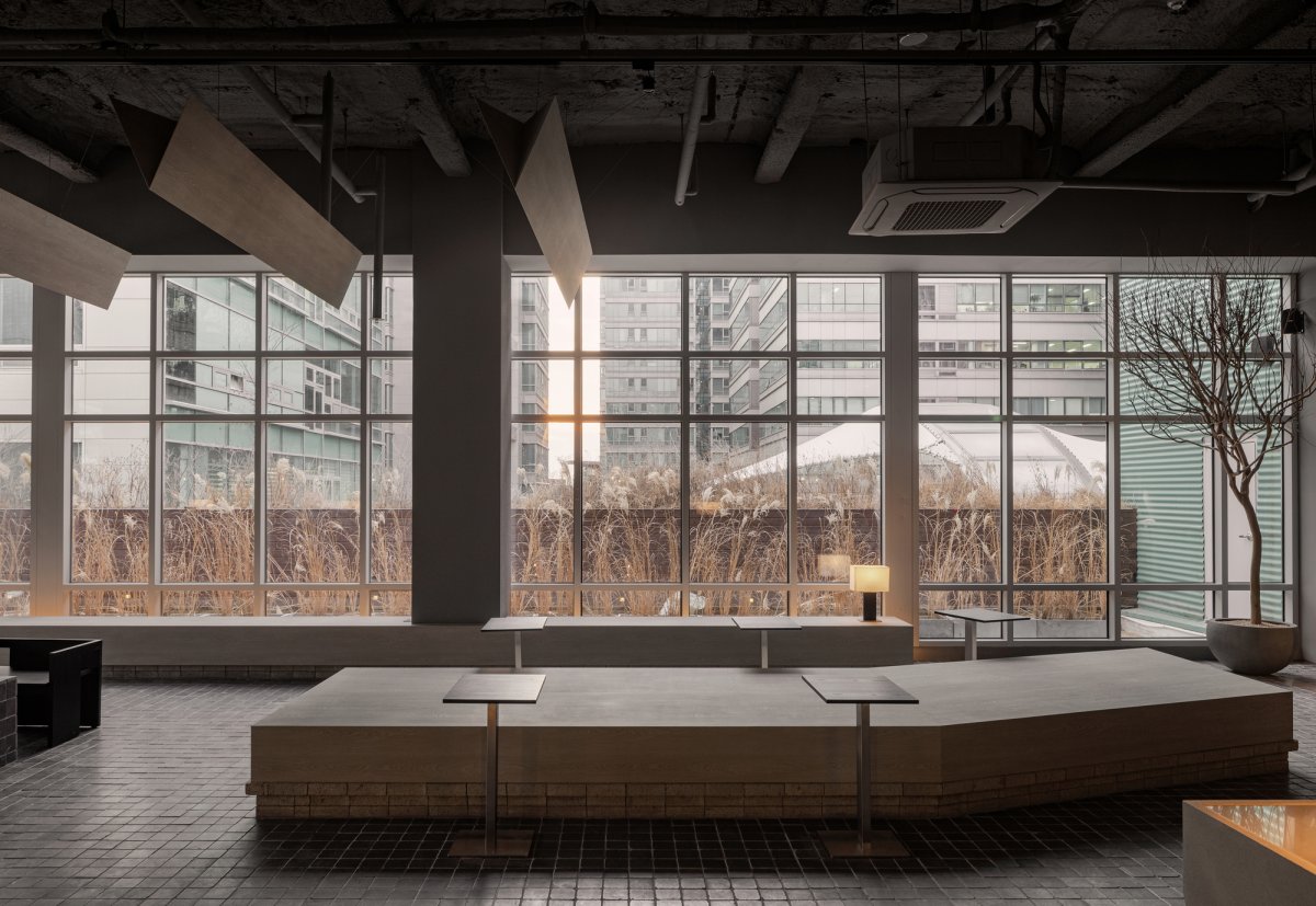
The Ohvenu Cafe by South Korean design Studio Yolllley Studio consists of an internal space and an external terrace with a perspective area of 297 square meters and is located between high-rise buildings. At sunset, the interior space is transformed into a monotonous terrace while the setting sun presents a magnificent view through the gap between the buildings surrounding this space. The design of this space which leads to the exterior terrace area along with two bent windows began from the thought that the inside and the outside should not be interpreted as different spaces.
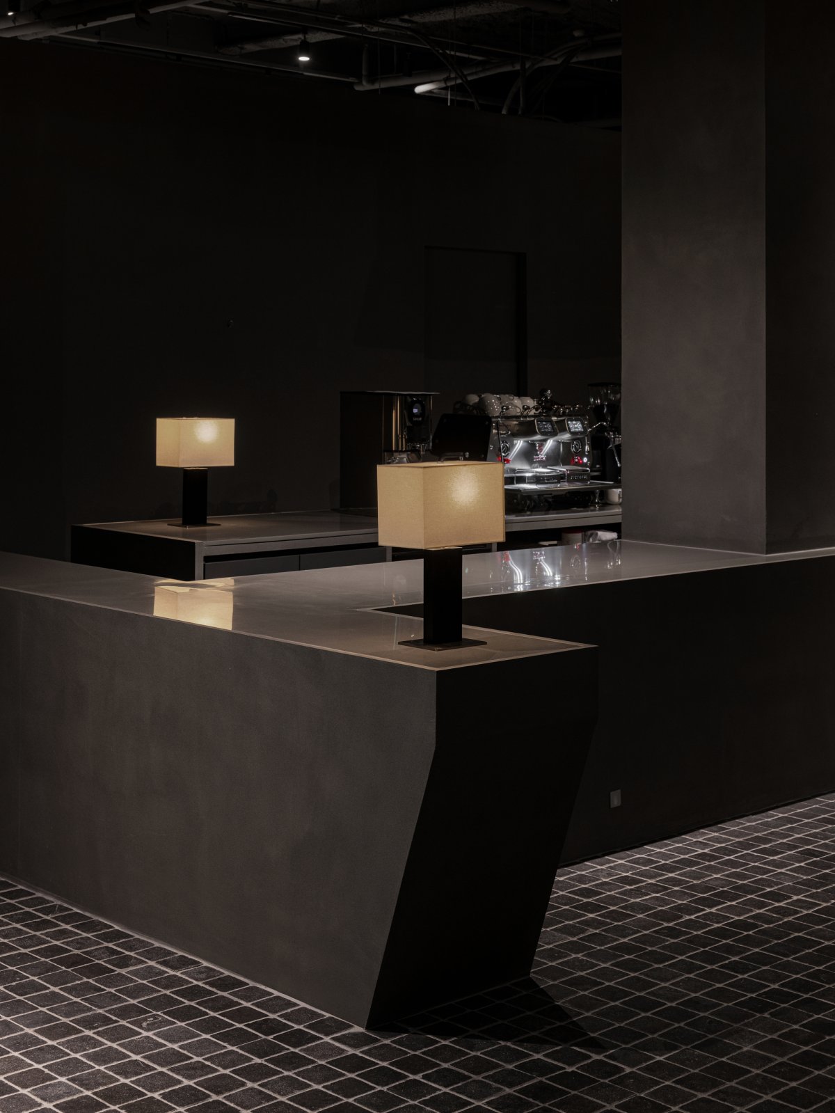
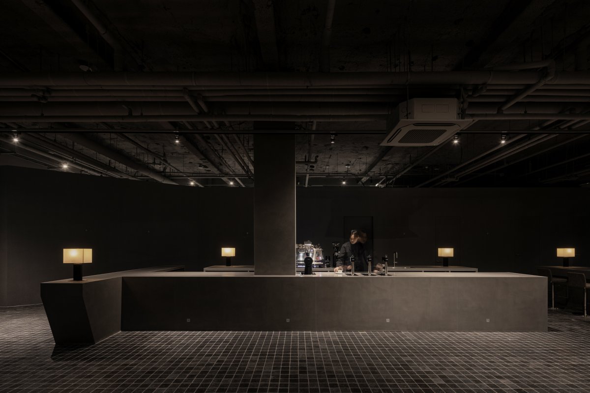
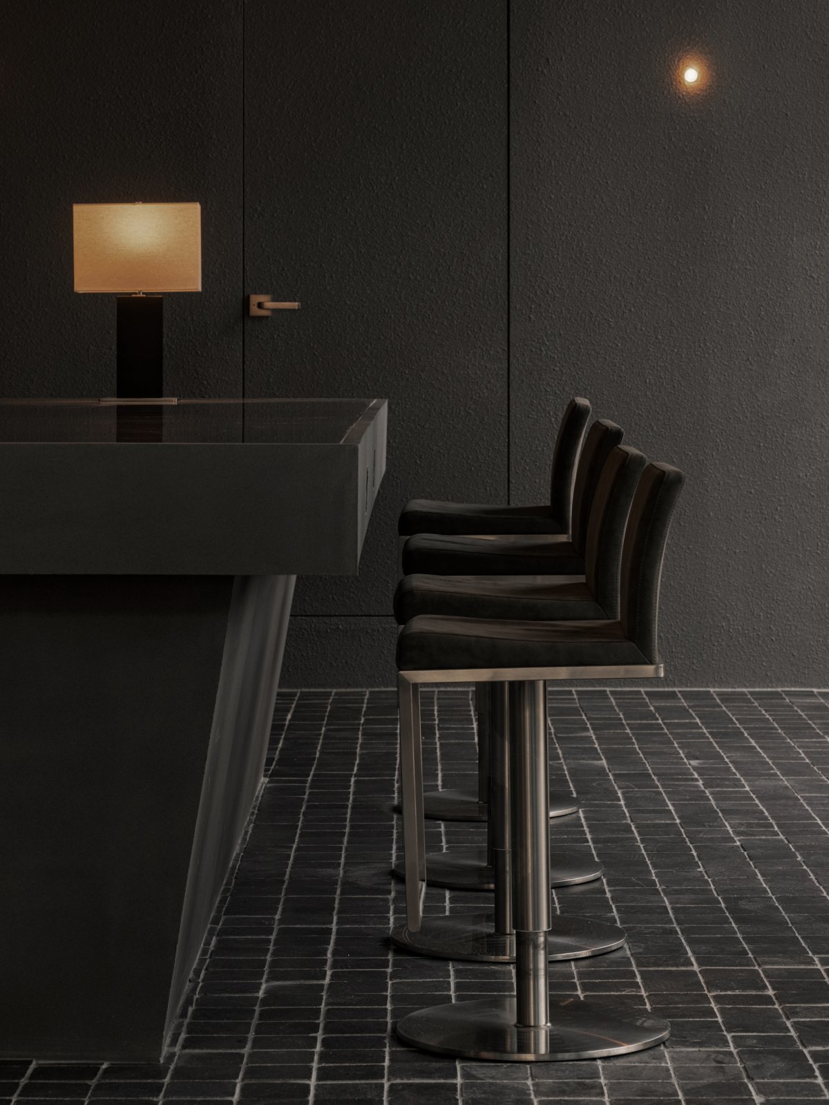
A mass formed by the structure of a long bar counter centering around a thick and square pillar in the front creates a spatial sense, and a sequence connected in order of ceiling-pillar-bar counter-floor marks the center of gravity in the space. The design team intentionally exaggerated the scale of the door which leads to the terrace at the end of the bar counter, blurring the boundary between the interior space and the terrace by taking the sunset and the night city view into the interior space.
The seating area with chairs and tables manufactured on the spot constitutes a mass with somewhat different shapes, but they are placed in harmony with each other, creating a comfortable and cozy atmosphere in contrast to the mass formed by the bar counter. An object is installed on the ceiling between the seating area placed in the center and that placed inside the window which provides the view of the reed planted outside the window. The object’s components are arranged at an angle where they can receive natural sunlight and artificial lighting at the same time.
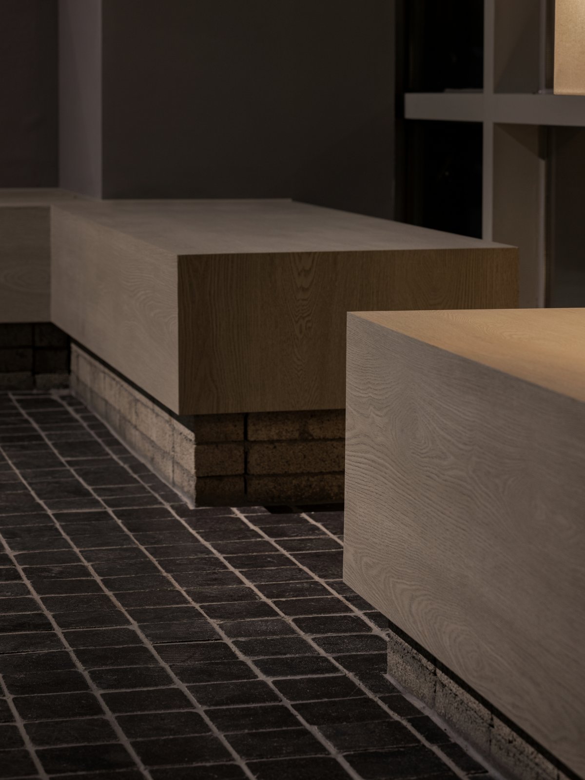
The chair with armrests designed to receive light through the opening between its frames and to send it out again serves as a symbolic and functional object that clearly expresses the feature of this space with the ambiguous boundary between inside and outside. As for the lighting plan, in general, elements that disrupt the natural light are minimized by using artificial lighting only for functional necessity and by applying table lamps and outdoor lower wall lamps. In order to emphasize the spatial feature, the ambiguous boundary between inside and outside, the design team selected stone, stone-textured paint, and brick as the main materials, revealing the spatial aim to be a terrace in the heart of the city.
- Architect: Yolllley Studio
- Words: Gina


