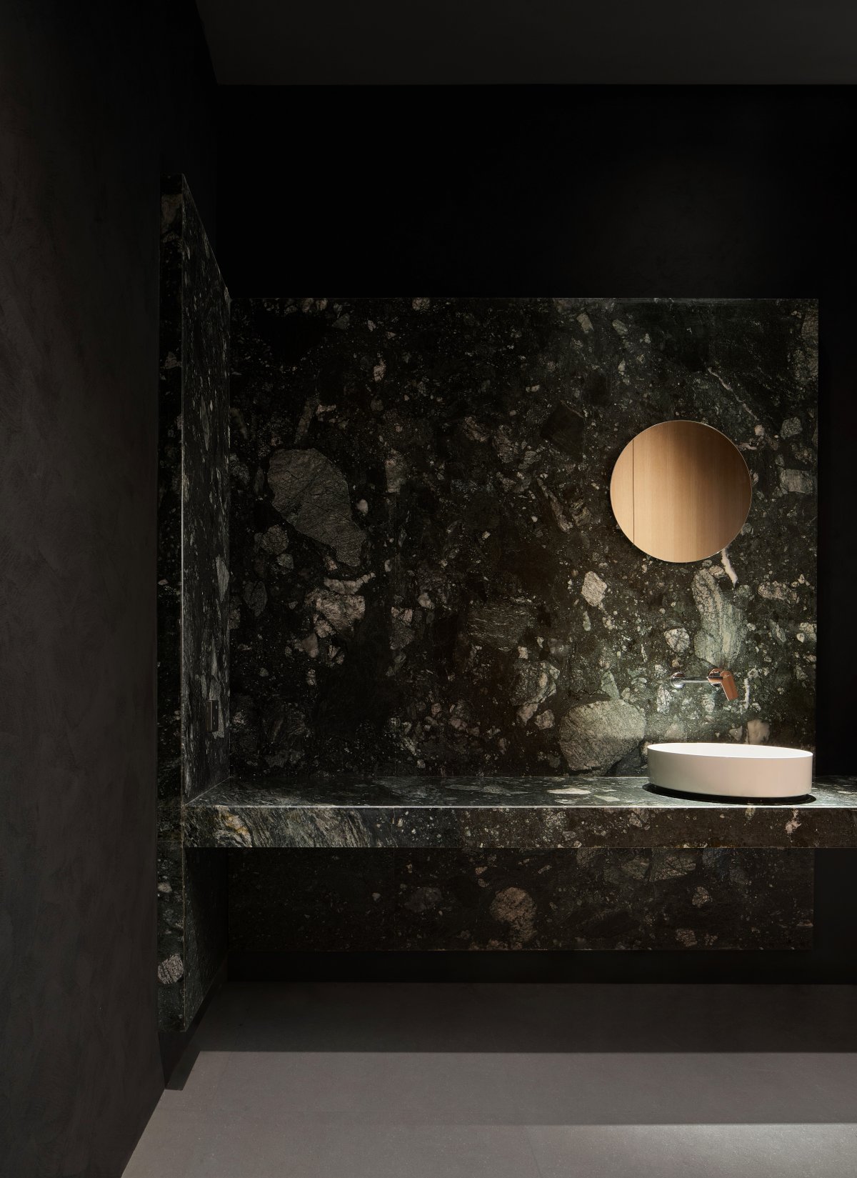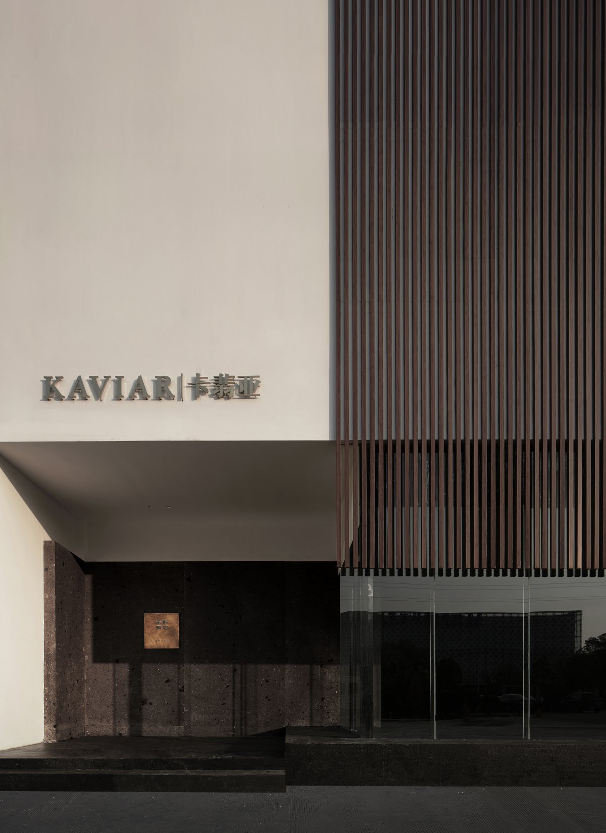
LÜ casa | KAVIAR Xuzhou Experience
"Atmosphere is my style." -- So said William Turner to John Ruskin in 1844.
By interacting with different things or objects in whatever scenario we are placed, our keen emotions play an active role and then we gain a perceptual experience with immediate feedback. With intuitive appreciation as well as relying on spontaneous cognitive reactions, an indescribable sense of ambiguity is then generated, which is in turn repeatedly confirmed by the subjective consciousness of the self. Context exists because of the field, perception is rendered by the difference of the subject in a rich inner form, and form shapes beauty and thus creates atmosphere.
Atmosphere Perception
━
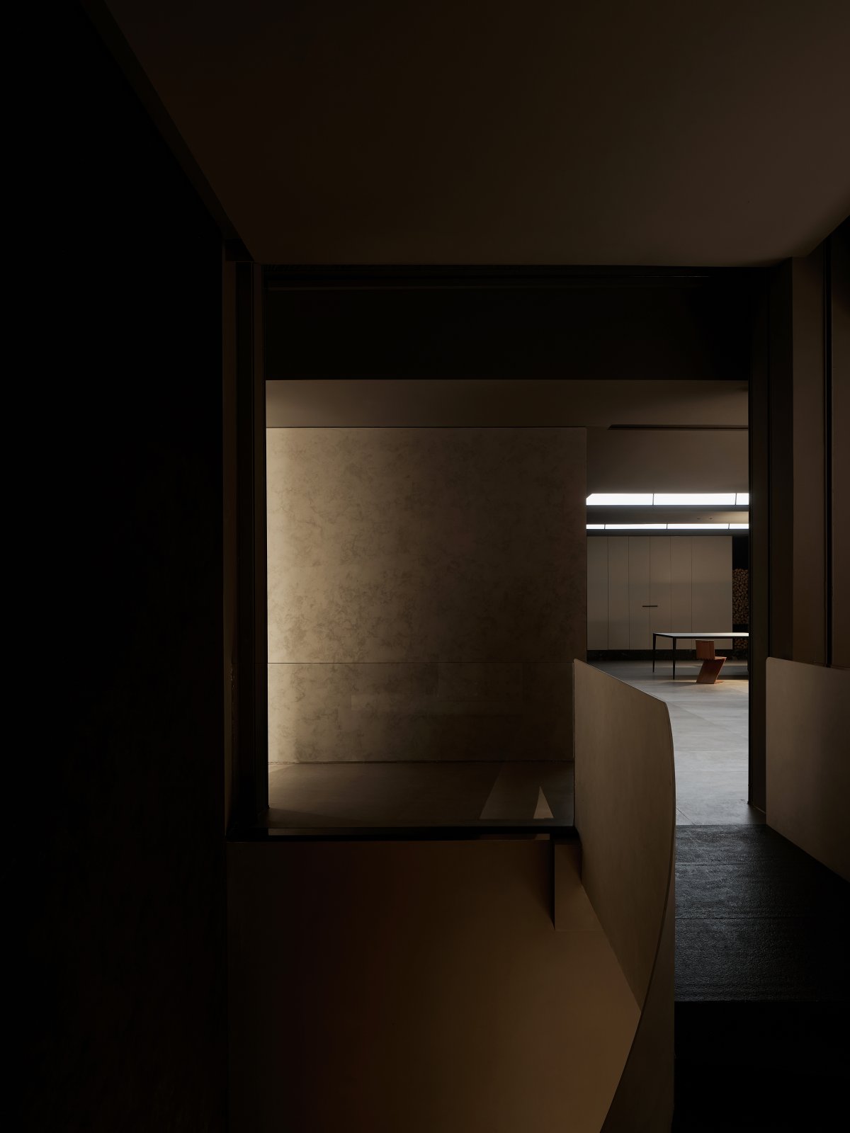
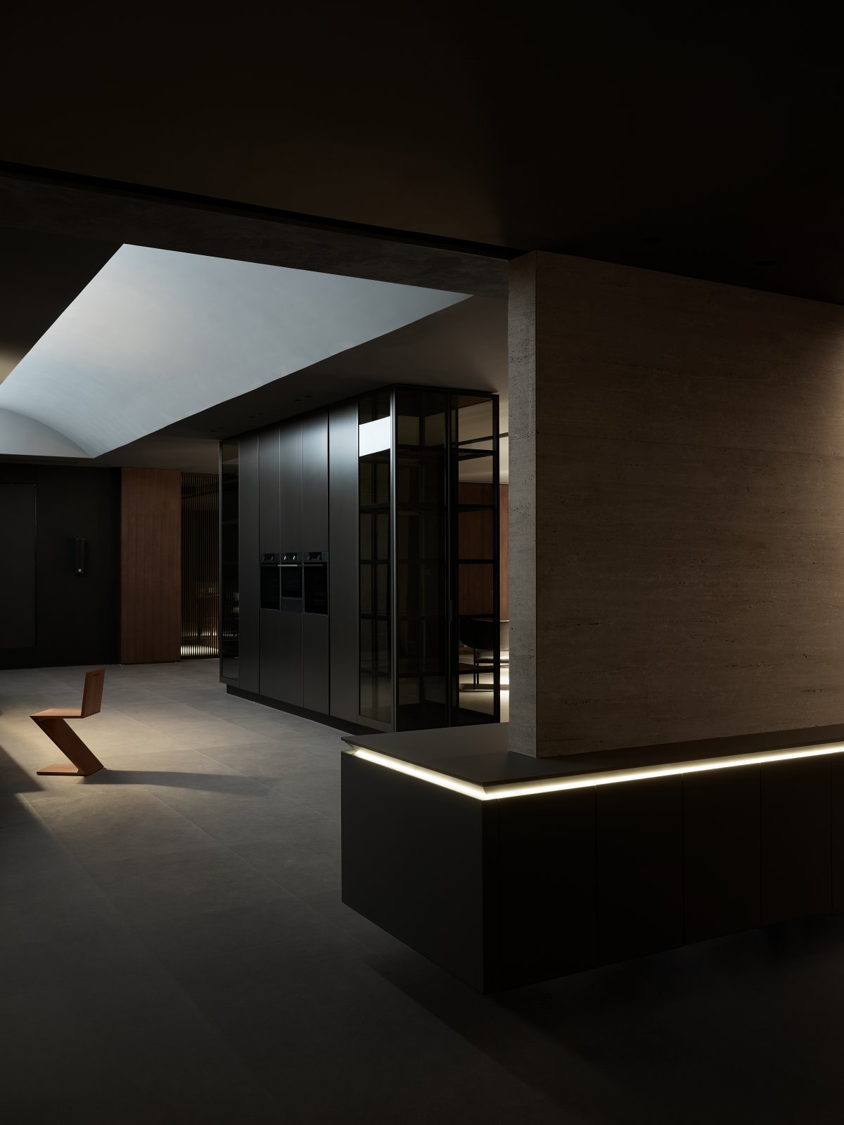
"Starting from inspiration, practicing ingenuity" has always been the brand pursuit of LÜ casa. As a supporting and upgrading of the existing exhibition hall, the second floor of the original warehouse has been transformed into an activity place serving for reception, social interaction and product promotion. From the ground floor up by a sculptural spiral staircase, the experience area is presented with a fluid floor plan throughout, while the actual functional space unfolds gradually according to a flexible circular moving line.
The Italian style of furniture has always pursued simplicity and refinement, reflecting taste and tone while often being unique in its subtleties. The product design, in particular, has the necessary functionality, attention to detail, timeless aesthetics and coordinated form. With the shaping of ideal life as the origin, new concepts and ideas act on different carriers, breaking through the single linear thinking, a sense of non-equilibrium visual or perceptual balance is thus brought to the fore.
Hidden Without Pillars
━
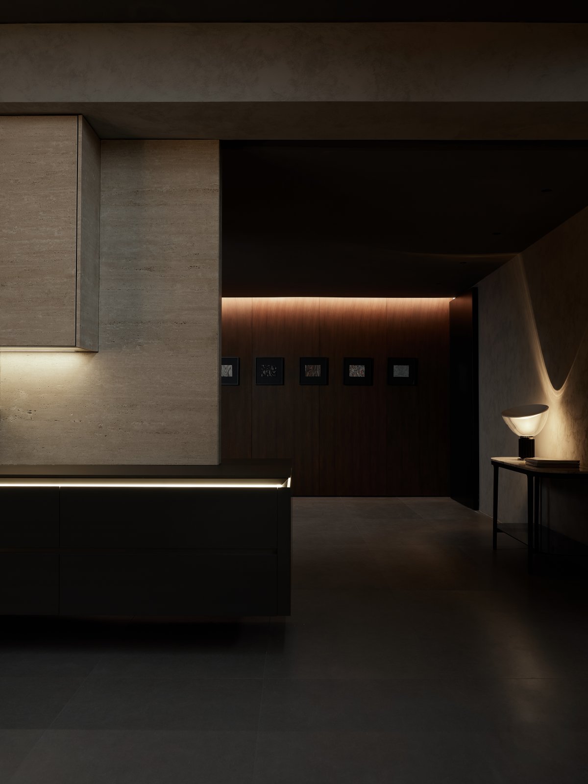
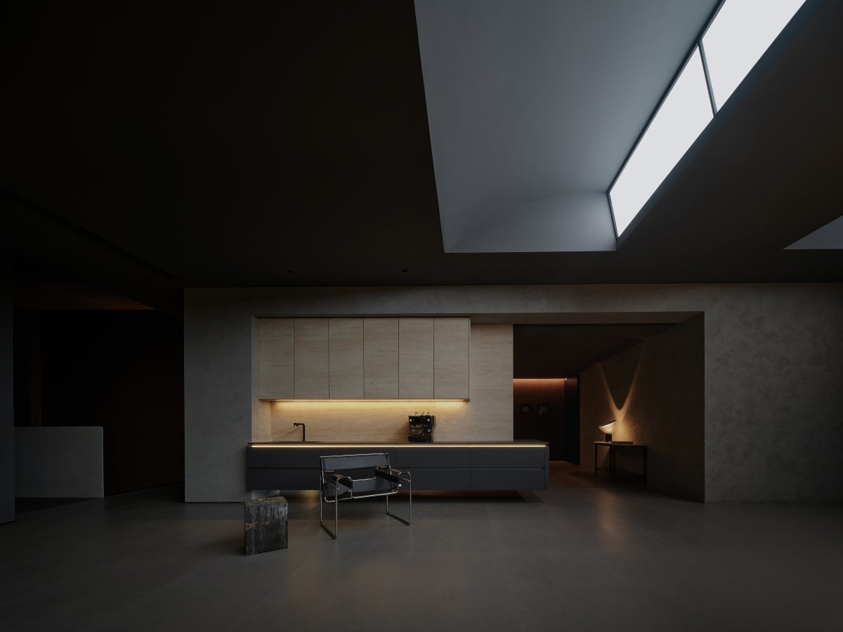
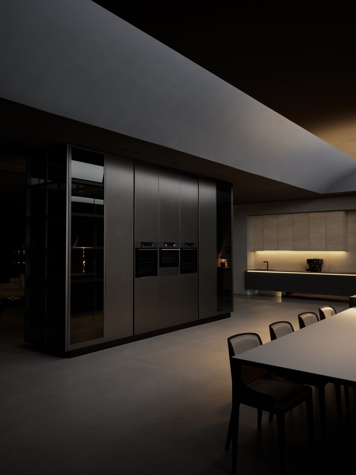
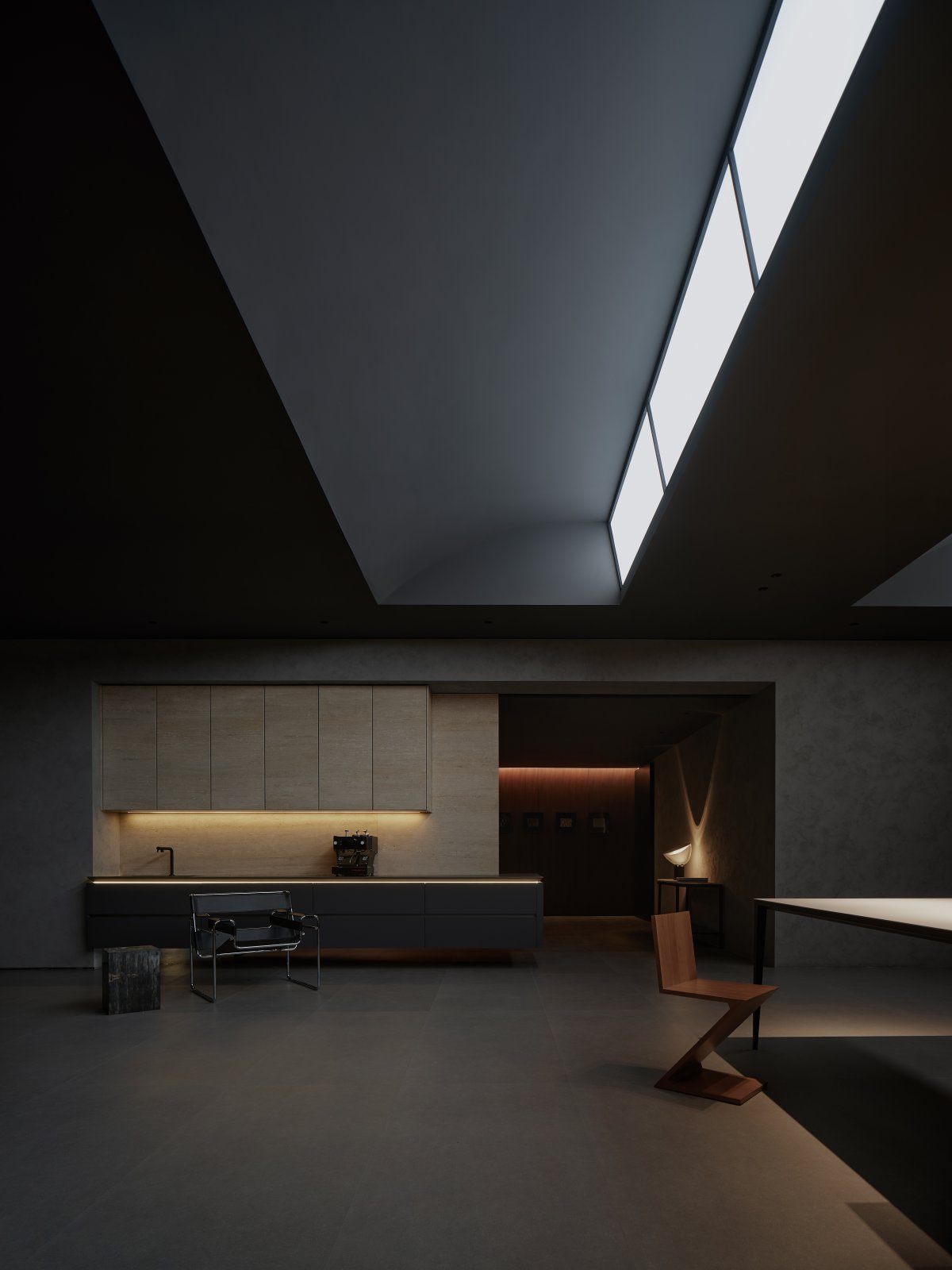
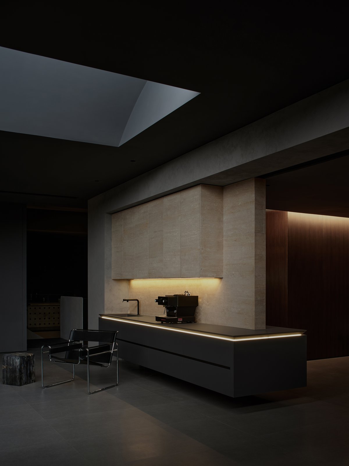
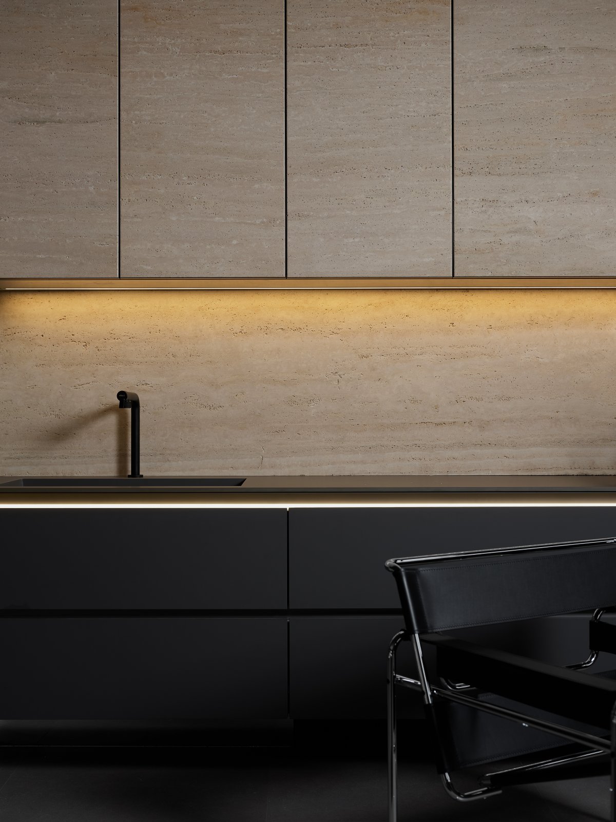
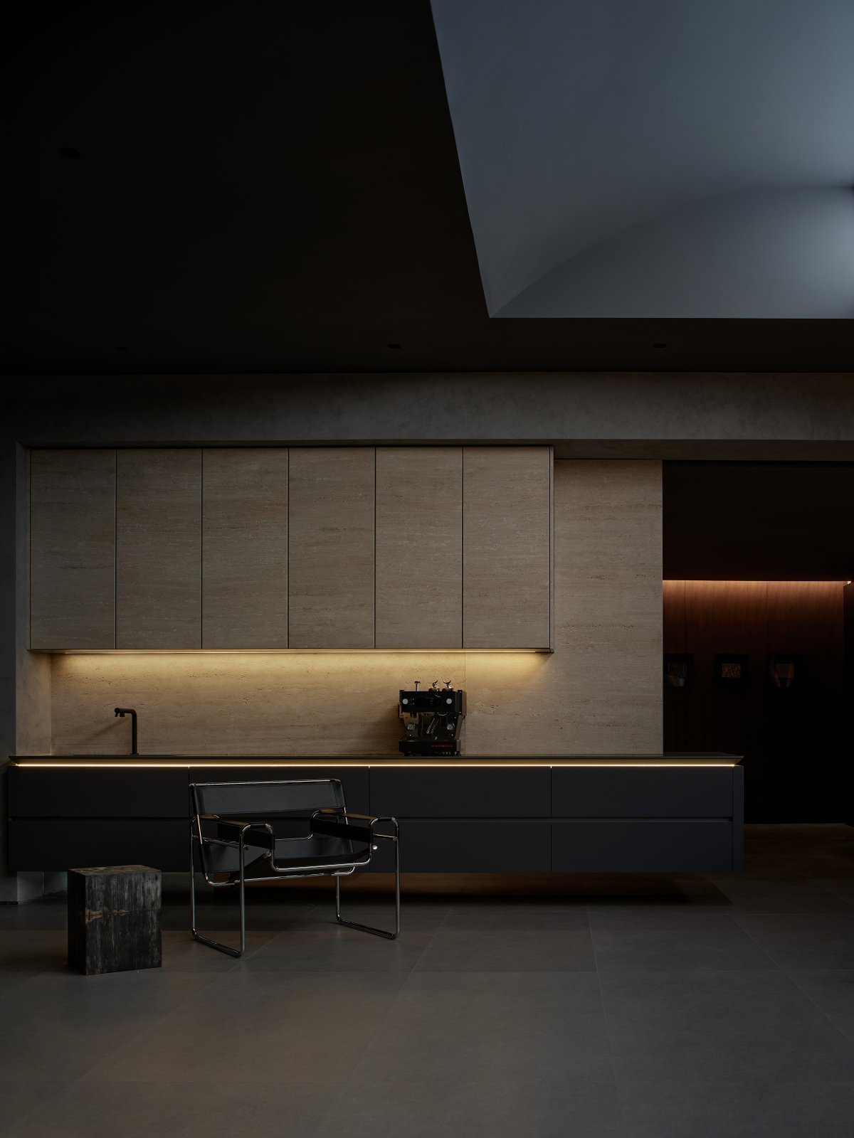
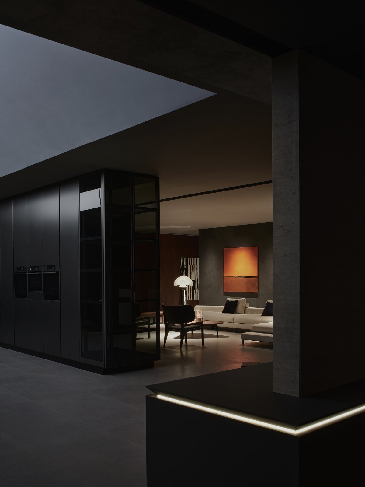
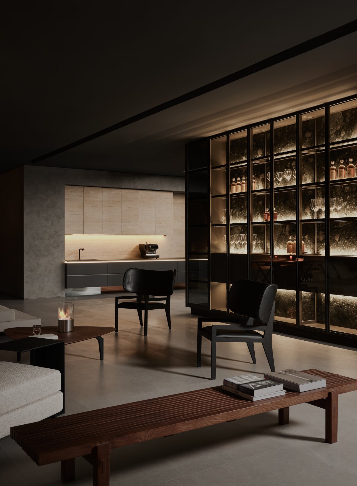
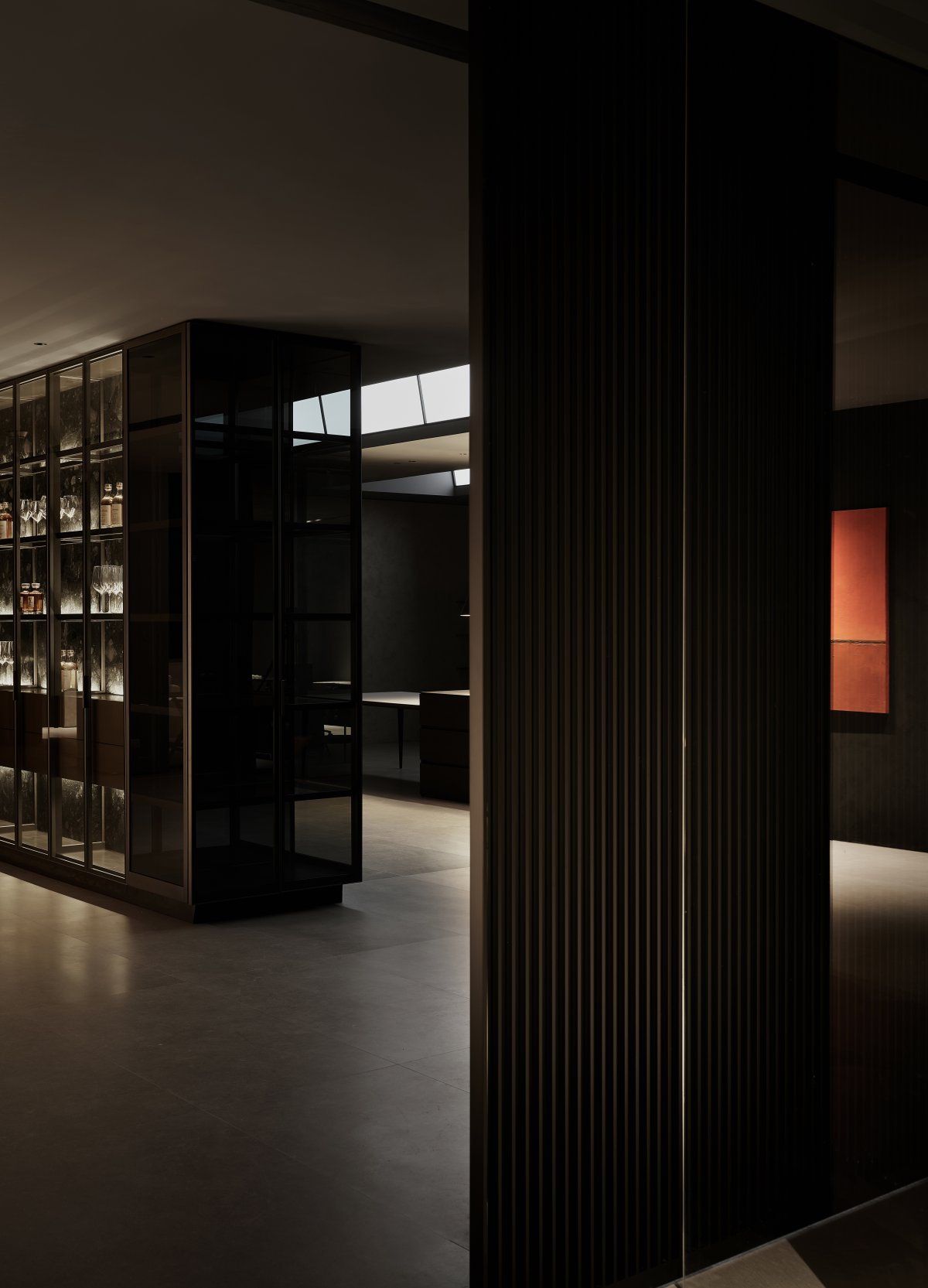
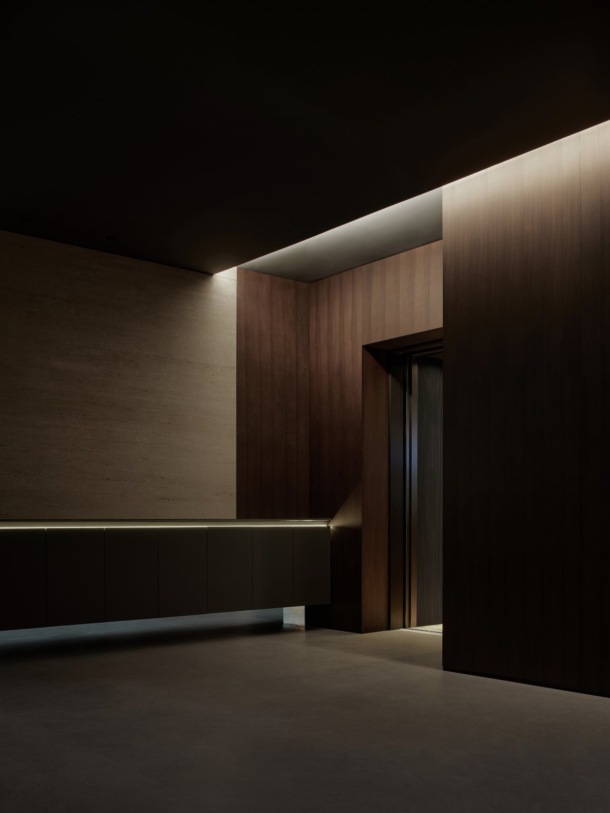
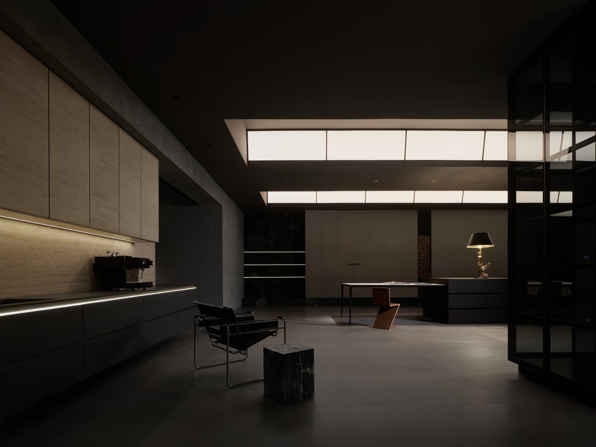
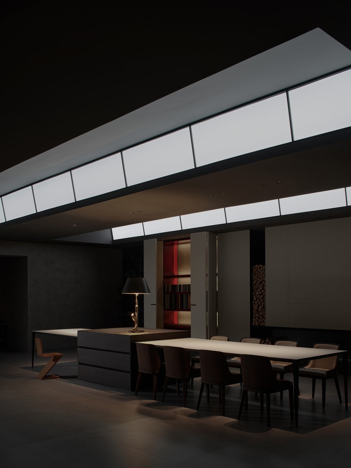
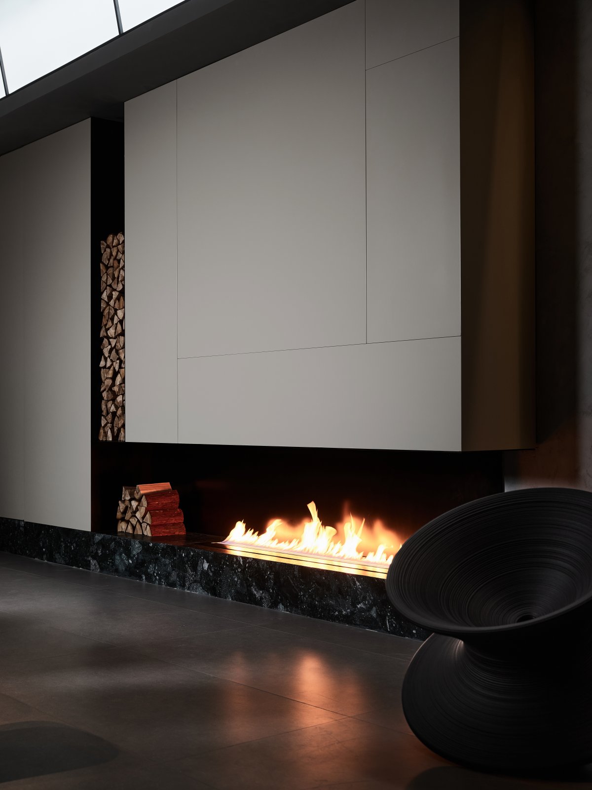
The main body of the building is supported by the beam-column structure, and with the advantage of the original longitudinal span, the only visible column in the main public area is hidden by the cabinet, and the vanished column becomes part of the cabinet, revealing an open space without columns inside. The cabinet is both one of the main functions of a normal home kitchen and an operation area to meet the reception of visitors. The travertine is overlaid on different surfaces because of the difference in thickness, and the façade material extends to the hanging cabinet door panels, forming a unified visible interface.
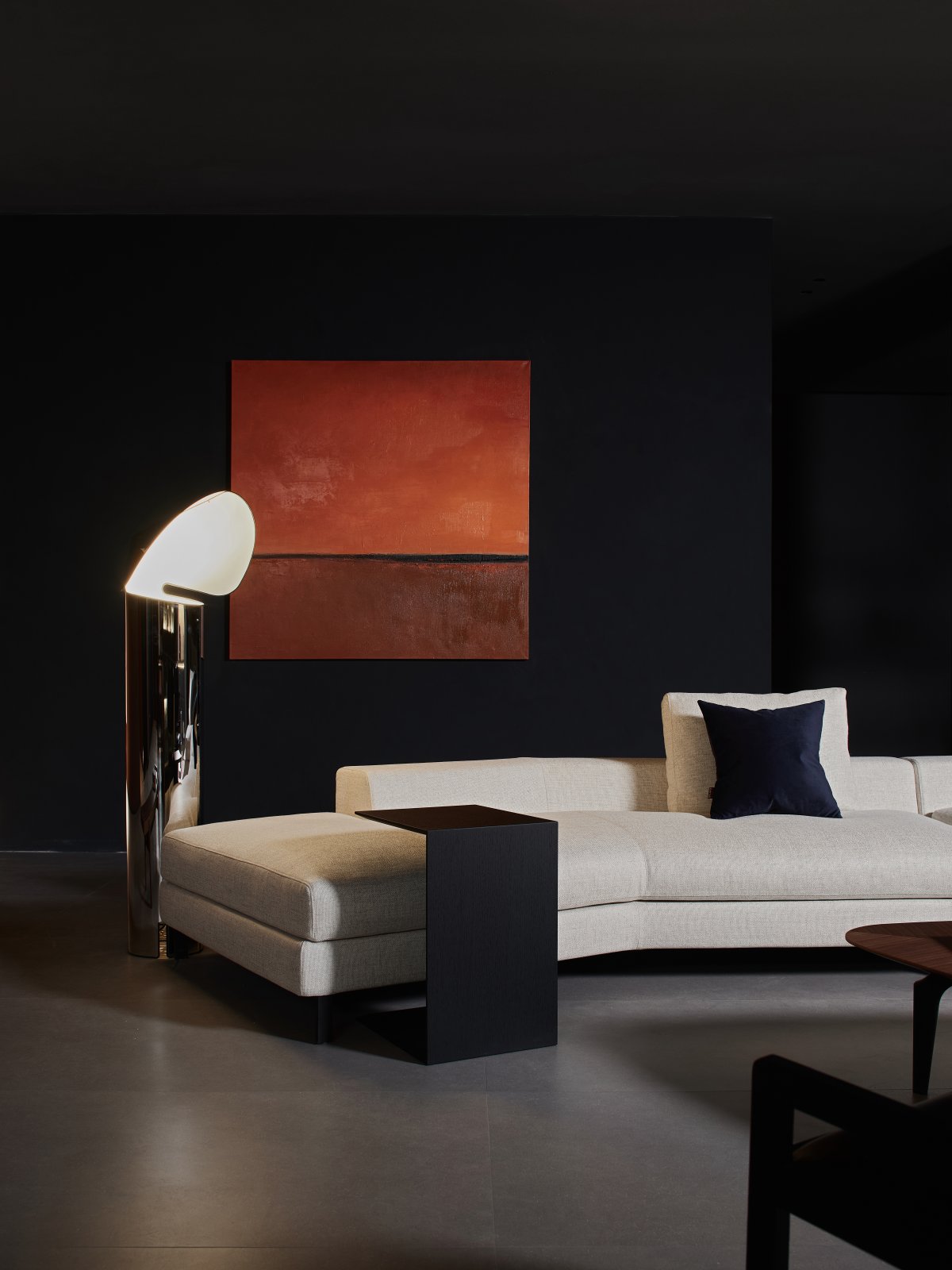
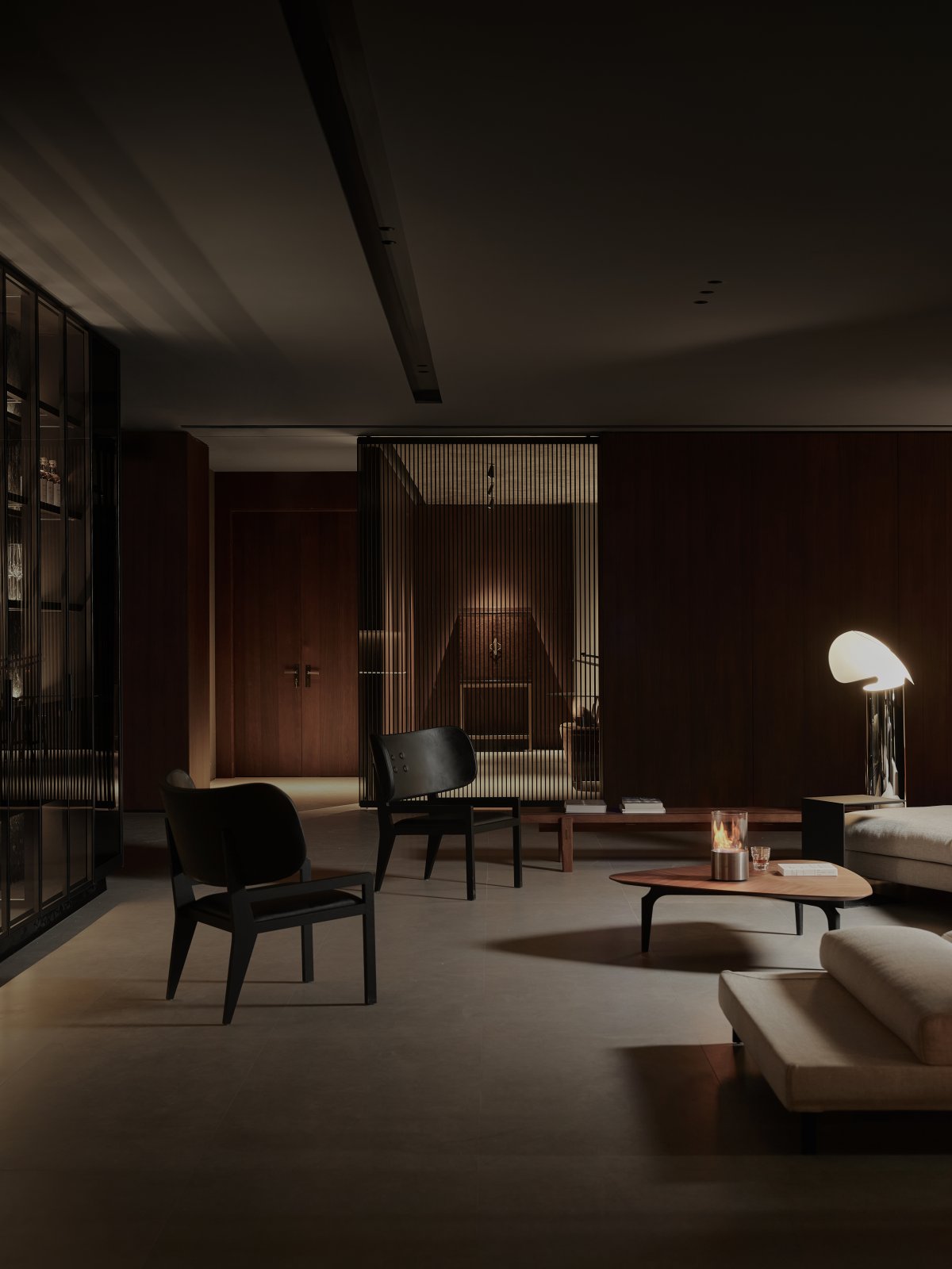
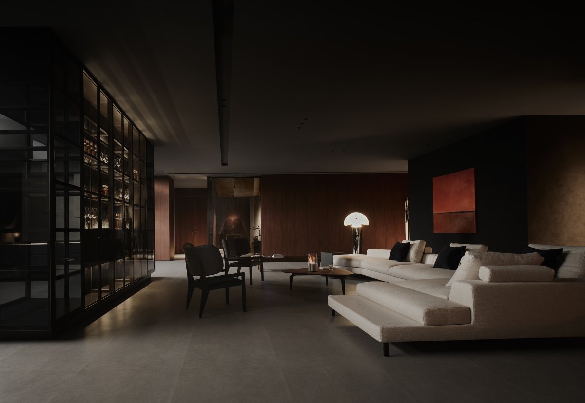
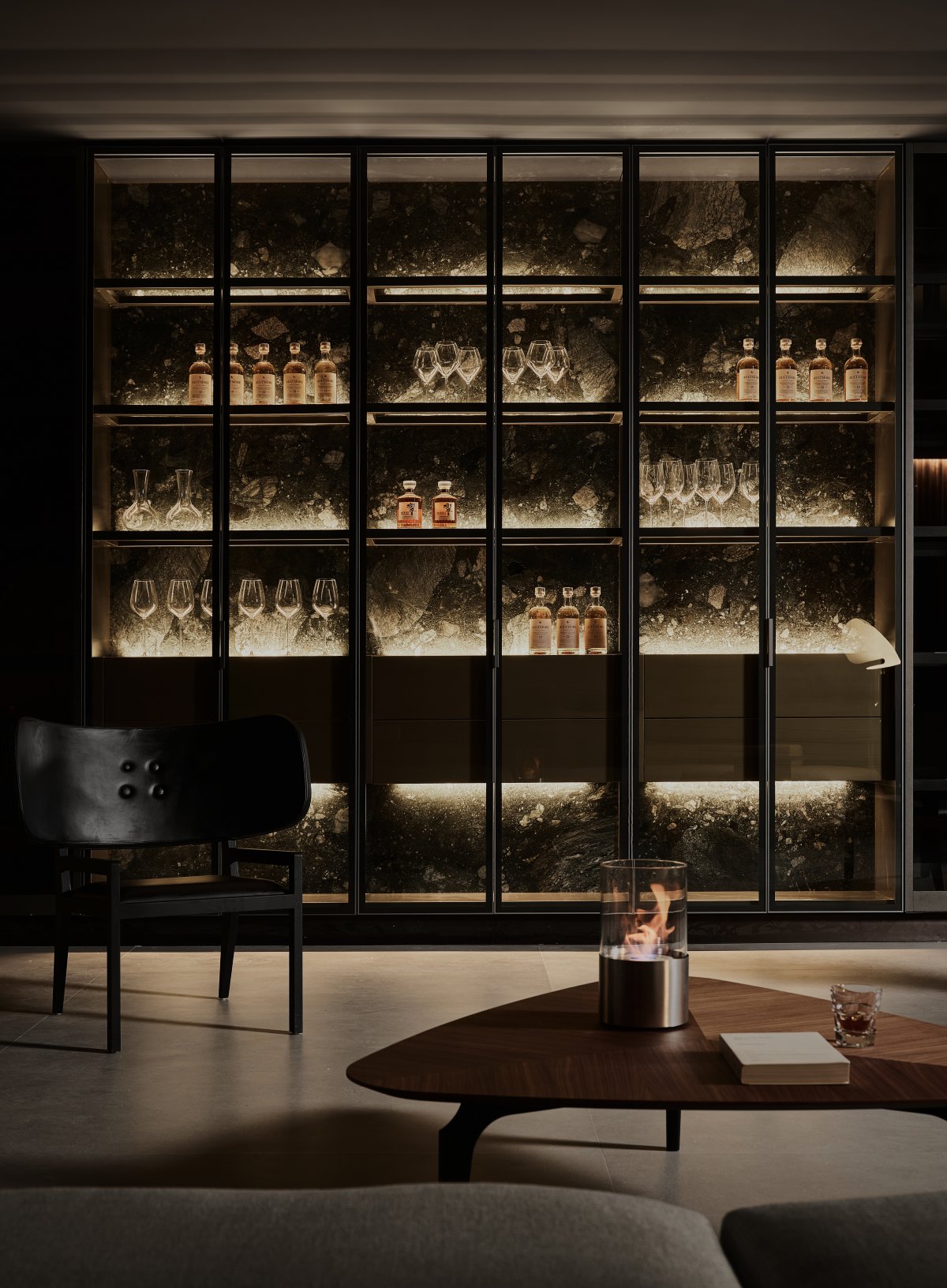
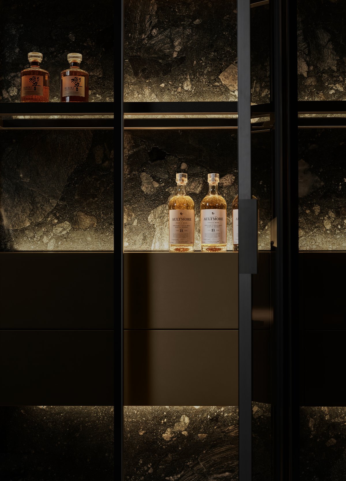
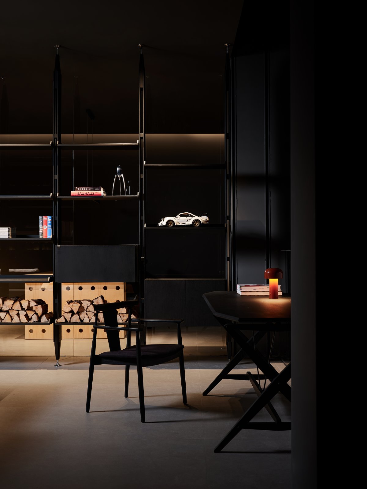
The casualness, freedom and spontaneity seem to be another embodiment of Italian lifestyle. The meeting area is centered on a multifunctional sofa, and the furniture is placed in a way that takes into account the actual needs and the characteristics of product display. In the square space, a vague central axis constrains the plan layout, façade composition and visual balance, and practices a balanced relationship between the solid wall paintings and the display cabinets.
Light Construction
━
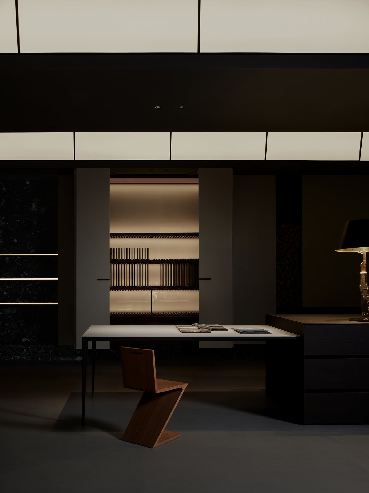
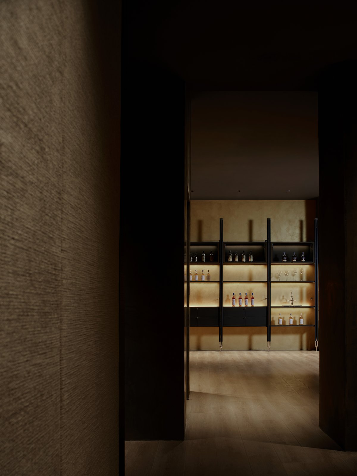
In one of his lectures on "The Light of Everything," Peter Pacto was struck and moved by the fact that Walter de Maria had taken him to see a new work he had done for Japan. In a huge hall with light in the front open area and darkness in the back, his only artistic gesture was to install a row of wooden grilles at the back, coated with gold leaf. The gold leaf shines in the deep darkness, which means that the goldwork seems to have the ability to gather even the smallest amount of light and make it reflect in the darkness.
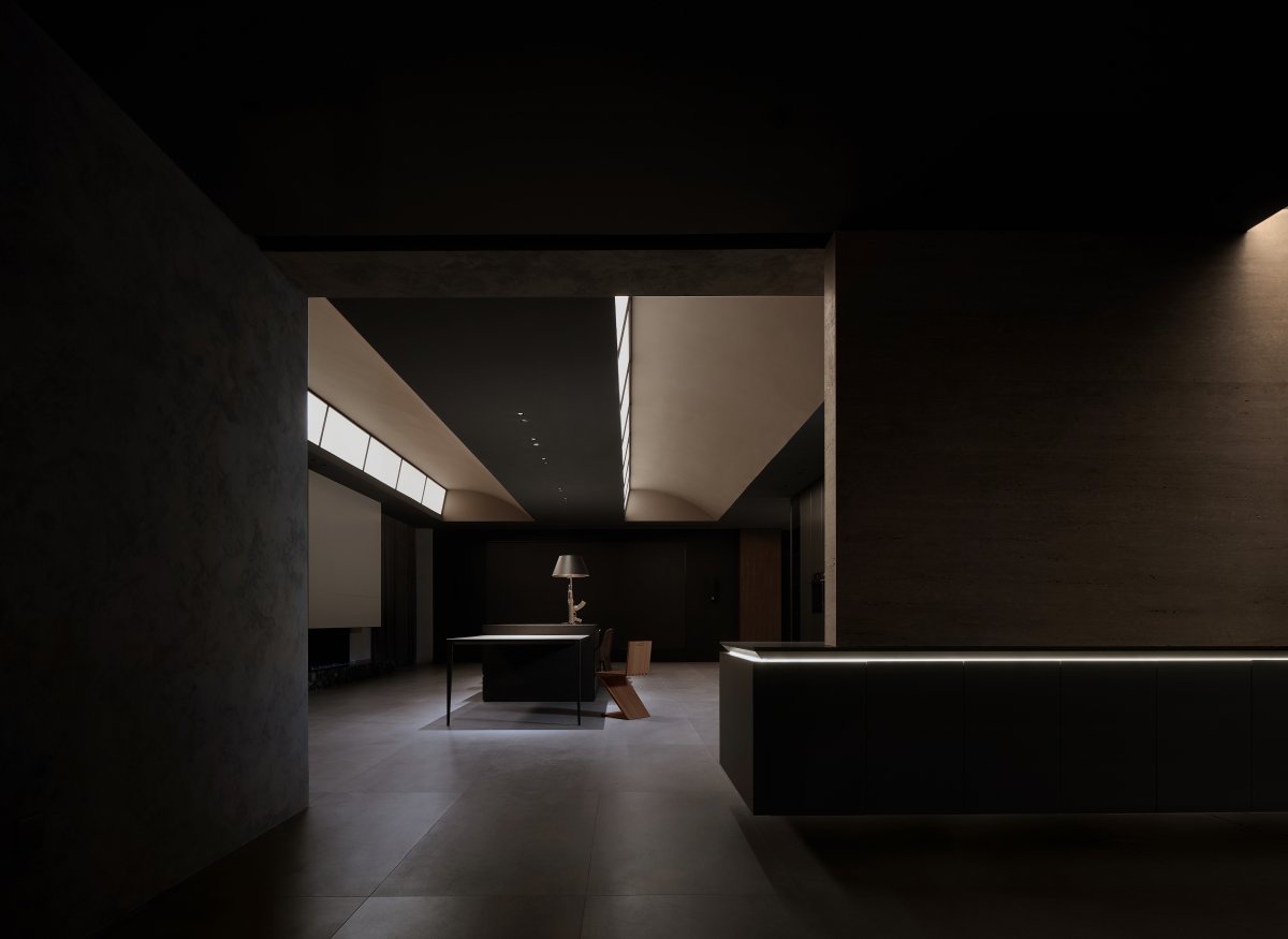
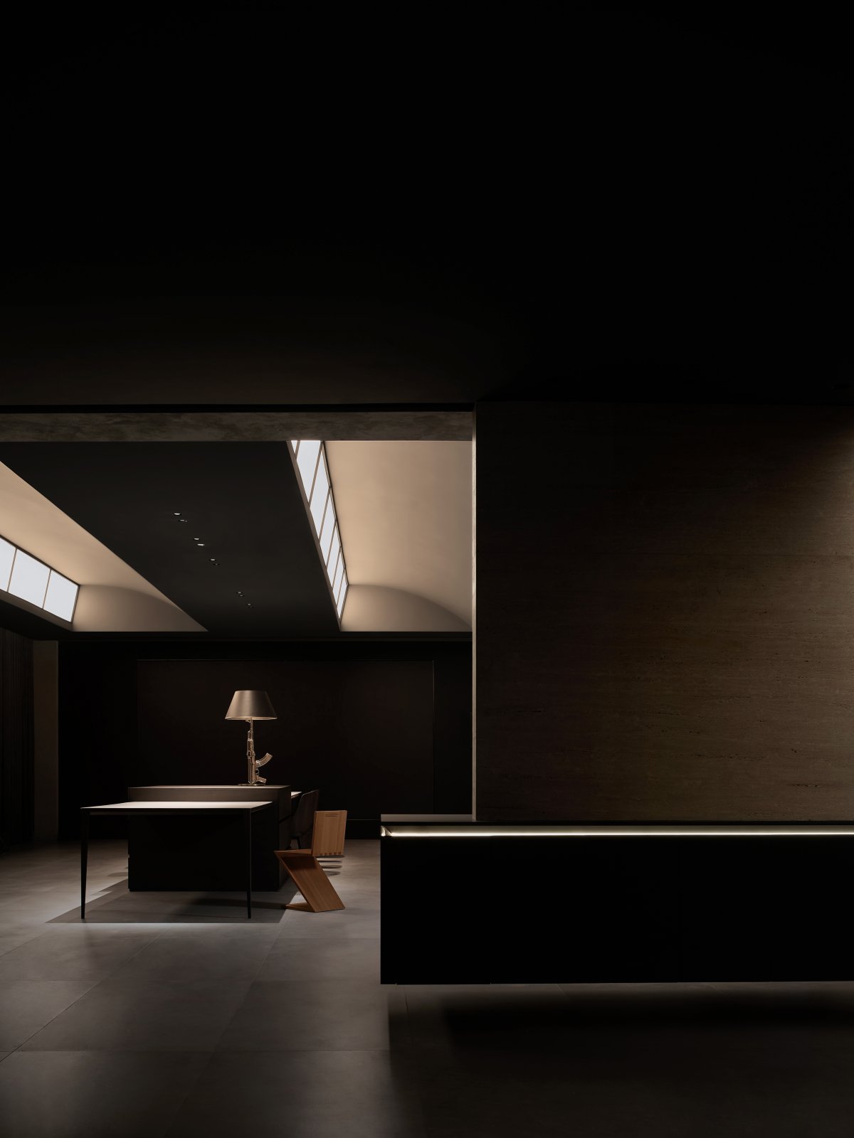
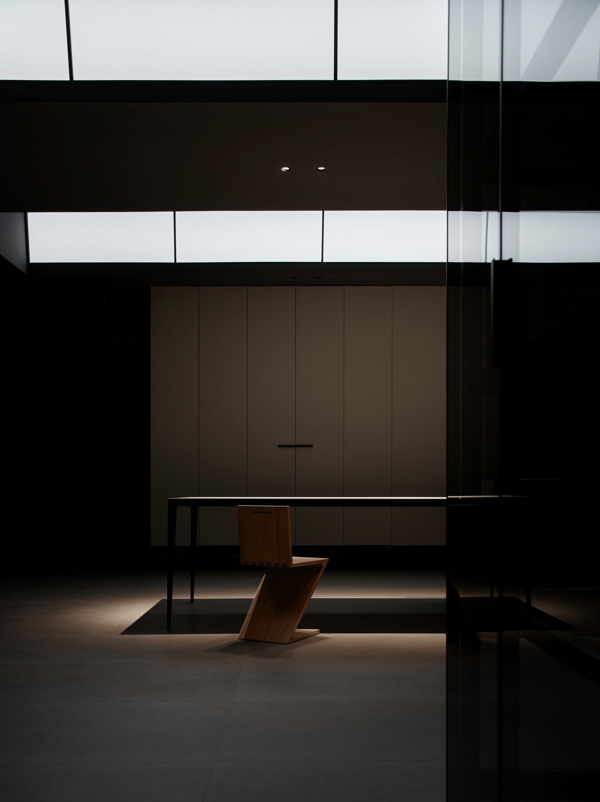
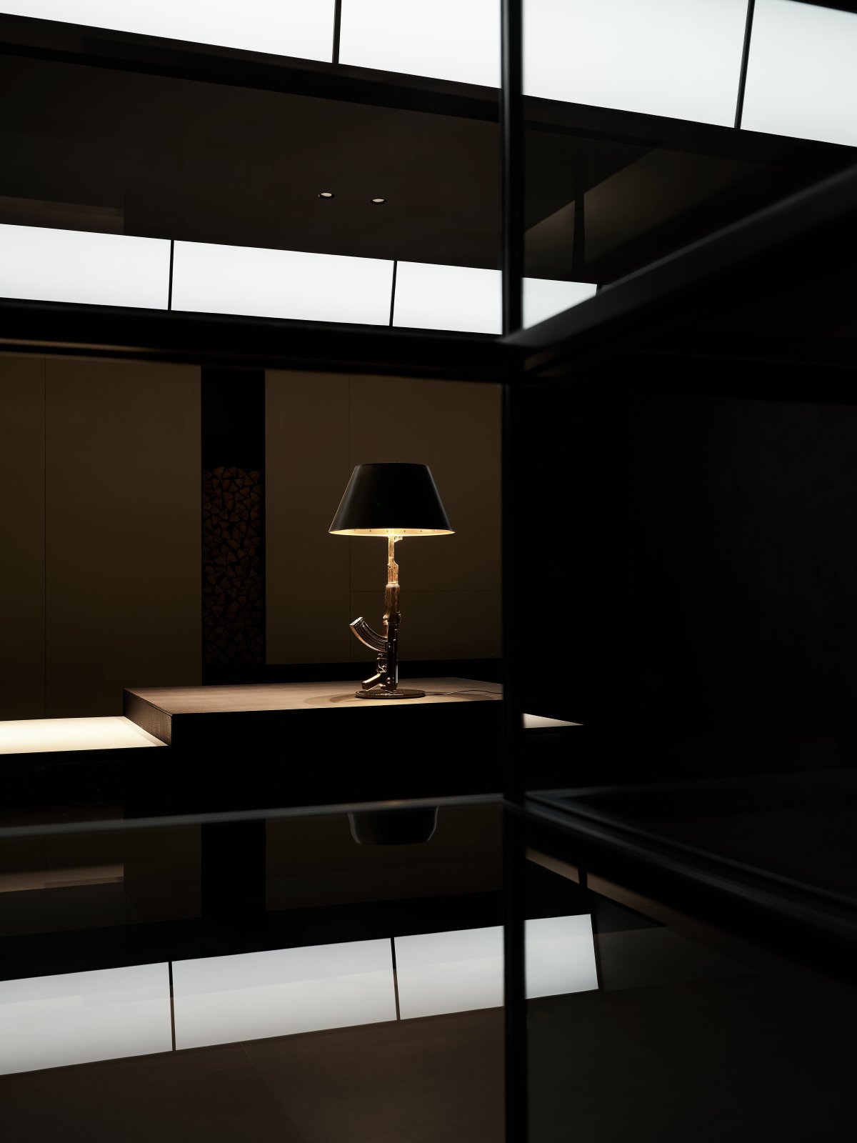
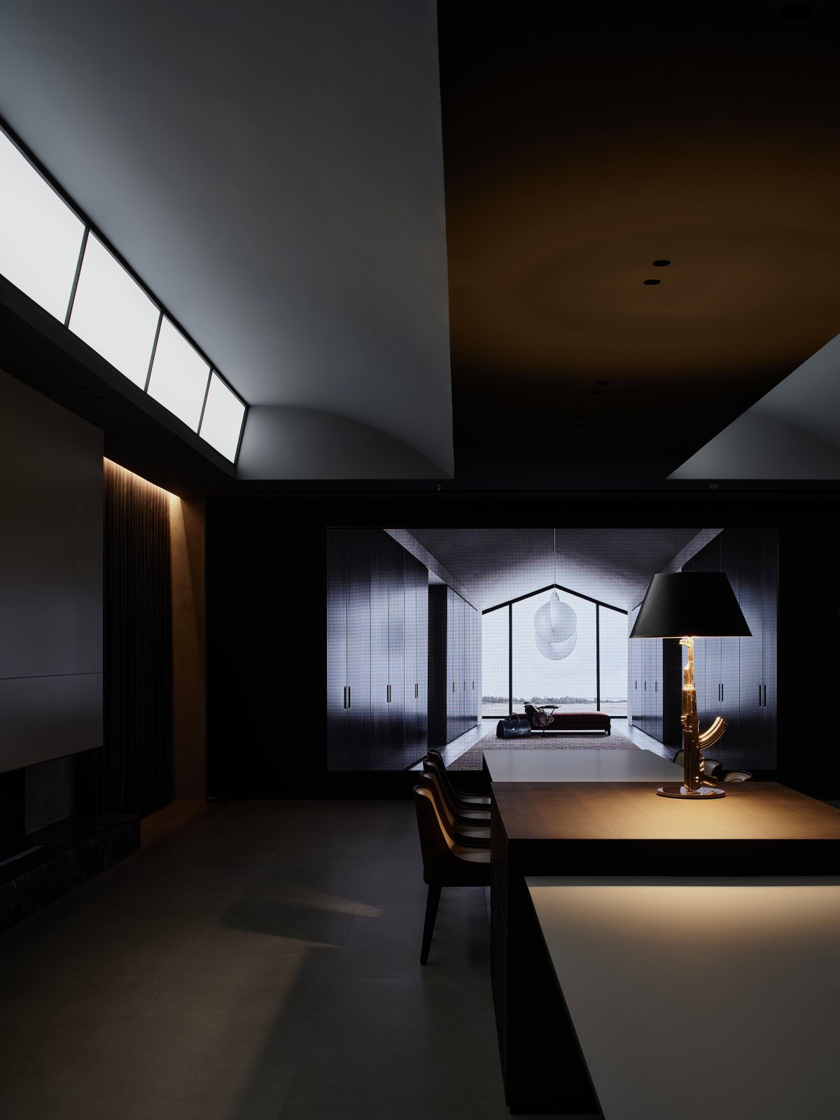
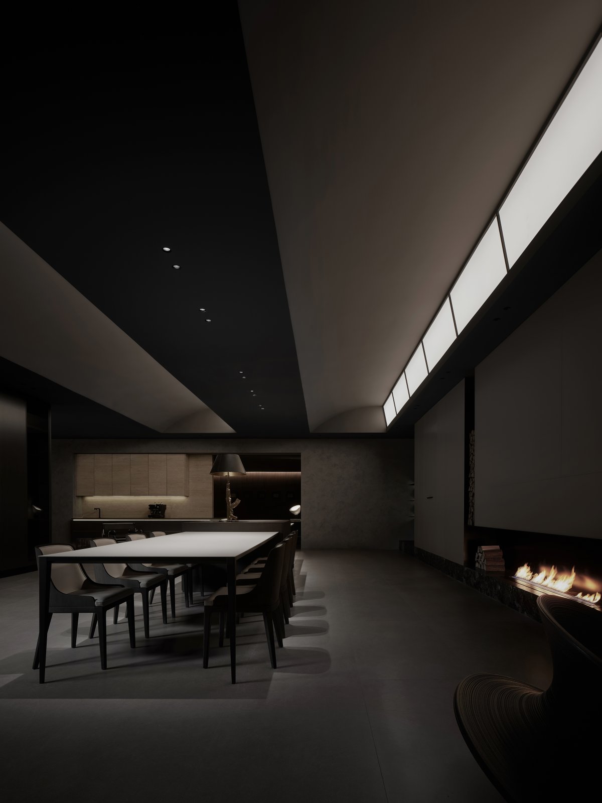
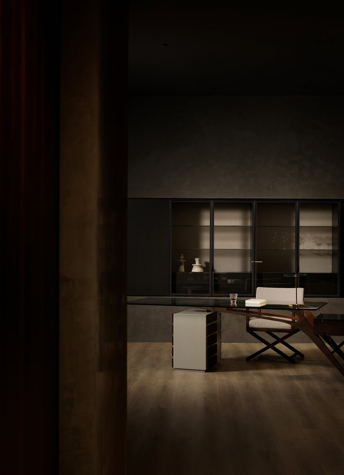
In the bar area, along the direction of the table, two monochrome surface lights on the ceiling appear obviously in the dark space. A certain Angle of tilt makes the light shine better. Meanwhile, through the coordination of the curved surface, more real natural light is simulated. For the second floor without natural lighting, the construction of light stimulates the vitality of the place. Meanwhile, the white light of the ceiling forms a certain visual contrast with the warm light of the interior, enriching the level and formal language of the space.
Flow Time
━
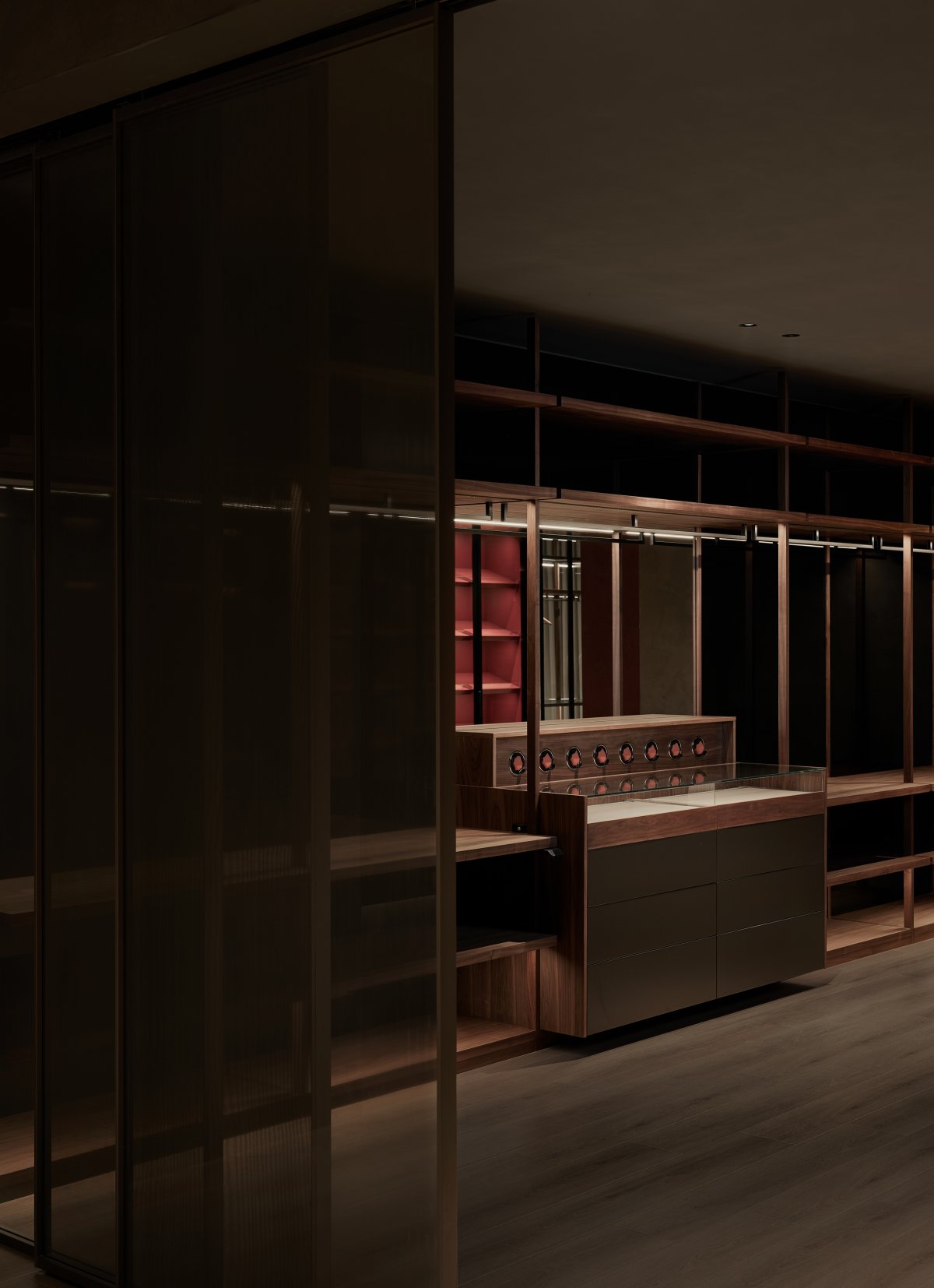
In addition to the free plan layout, the elevations are also free. The facades flow with each other and define the space through the difference of materials. There is the transformation of the virtual and the real into each other, and the close combination of the soft and the hard, open, harmonious, and haloed in an overall atmosphere without a clear style or tone. The components composed in the daily home scene are displayed in the space, accepting the high definition of aesthetic needs, or randomly combined, disassembled and reassembled according to the existing modules.
"Flow" is an expression of design language, or a path of behavior of field consciousness, and a specific feeling of space; the interpretation of "time" points to a more vain concept, because time is not a state of relative stillness or absolute movement, but rather a state of stillness and movement. It is the interaction of stillness and motion that gives the three-dimensional space its temporality. But more directly, "time" can also be interpreted as the brand's continuous self-renewal and iteration, and thus the original intention of moving from the original to the classic.
- Interiors: Zhen Design
- Photos: Single Line Architectural Space Photography
- Words: Off-Words / Moon

